
Geomatics and other industries which desire data in accurate yet visually stimulating presentations of communication and information are frequently turning heads at the evolving use of infographics. This inquiry of data and technology fused with creative art and design in geomatics is no stranger to the trend of looking impressive, but being factual. The grand migration of corporations, research and informing the greater public with the clever use of maps of a different style is changing and charging ahead.
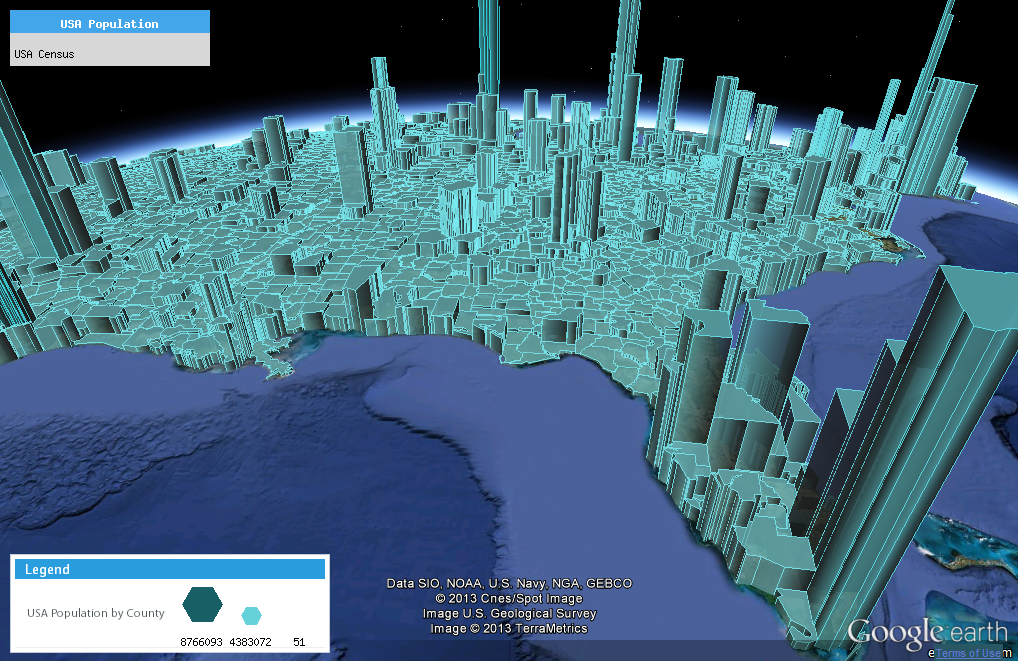
A competitor in this race of infographics is DataAppeal, one of its co-founders being Nadia Amoroso. DataAppeal provides an alternative to complex mapping tools thanks to its easy to use, web-based GIS application that renders typical data files into beautifully designed multi-dimensional maps and datascapes instantly.
After registering, the user simply uses the application on the website by uploading a spreadsheet data file containing latitude and longitude coordinates and the numerical values that correspond to those coordinates. With the use of Google Earth, a simple white-tone default map is initially made. For those who require assistance, tutorials are offered on the website on how to prepare data files for mapping. With the Appeal and Enterprise licences, the team at DataAppeal will also offer some design and technical support, and assistance on how to use some of the applications’ functionalities.
The visually unique aspect of DataAppeal comes into play due to the selection of various graphic and design features. This includes a palette of colors, opacity settings, scaling, and model styles that push dimensions and truly live up the term datascapes. For those wanting more creative expression, the premium version offers many more advanced graphic and analytical features such as 3-D maps with custom images or textures around data models.
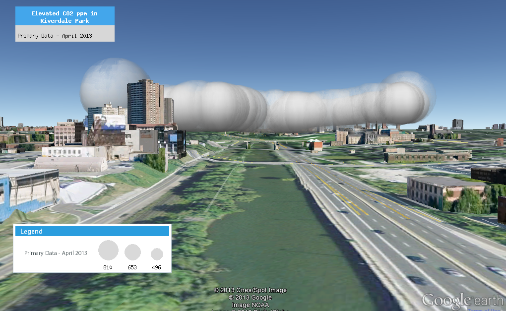
But even with these useful and picturesque features, DataAppeal continues to grow and enhance its capabilities thanks to additional options in design and tools we would love to use. The “Buffer Ring” feature (or simply the ring) is a new function that allows users to spatially visualize the radius distance. A tool many of us would find quite useful when analyzing areas of interest, perhaps walkability regarding distance around and between public transit stops or audibility from sirens. This function is great for retailers, sales corporations, and supply chain managers as a means to visualize the distances of the customers or where the products are coming from.

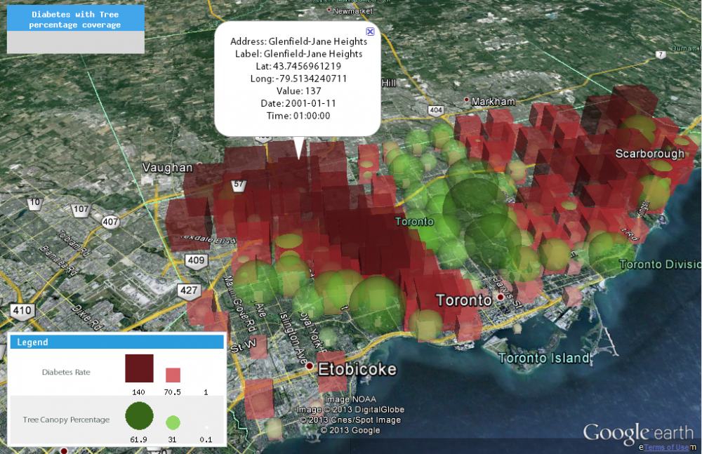
The “Grouping of Similar Values” and exhibiting points of interest is another analytical feature provided through colour intensity shading. This can be of further interest when multiple layers of information are presented together, with the possibility of identifying patterns. Trends could also be found if changes in date or time are in the dataset. The datascapes will animate, meaning that this application can visualize growth or regression. There can be movement of the models, reflecting pedestrian flow or green growth expansion.
Pedestrian Density overtime clip
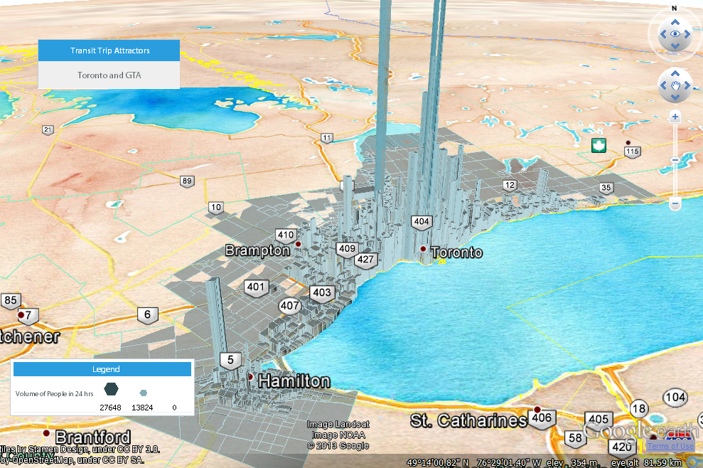
Arguably the canvas in which the model stands on can be just as important as the beauty and accuracy of the model itself. Offered through the Appeal Version of the software, the new “Digital Globe Canvas” option, targets designers of the built environment to control the base-map wrapped around the Google Earth globe. The selection of graphic styles is provided by various sources, including MapQuest, OpenStreetMaps and the creative works of Stamen Design. This is also a great feature for companies wanting to market or visually communicate their information to clients and stakeholders in a new way.
Being a web-based GIS application, this allows users to access their data and designed maps from any computer. Using the URL link to share through email and social media, a user’s datascape is easily accessible for their colleagues and clients to see. With Google Earth as its platform, Google Earth’s features are also provided. This means you could have a digital venture into the city as it is, with your data creativity layered on top.
So how does or how can DataAppeal help industries use data effectively with visual prowess? The retail industry, using a geographic perspective, could improve sales by determining where customers are coming from, improving site location, accessibility and education of GIS on a local managerial scale. Healthcare, which has the potential of having location based data readily available, can have a greater impact on decision makers by better visualizing healthcare concerns and the notice of trends. Educational sectors about planning, architecture, design, the environment and of course geography would have a tool that introduces both GIS and infographics in an exciting but easy to use form. DataAppeal also offers consulting services and system integration with other organization databases. They offer mapping software customizations as well and a la carte mapping design.
Perhaps the best way to know DataAppeal is to experience it yourself. Nadia Amoroso will be teaching a one-week ‘Datascaping and Mapping’ workshop in Las Vegas called-Landscapes of Information: Mapping the Invisibles of Las Vegas. Participants will explore topics on mapping visualization as it relates to contemporary visual representation of the city and its landscape. This one week-course is targeted towards professionals and students in architecture, landscape architecture, art, design, urban design, planning and geography interested in learning about sustainability, urbanism, geo-design, creative mapping, designing with information and using design thinking.
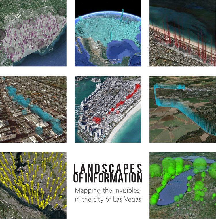
Please see this link for more details. http://www.unlvddc.org/landscape-of-information/
The application of DataAppeal is a type of simplified GIS application, which takes it another step further with its intuitive use, visual uniqueness, design capabilities and multidimensional aspects. It puts a visual flare to the site information, while offering further insights to the data. Sign up to use the application for free at www.dataappeal.com. Want more? Get the Appeal or Enterprise version for companies and organizations. It’s very affordable.
For more information about the application, its use in practice or in the classroom setting, please contact co-founder Nadia Amoroso at [email protected]
Be the first to comment