
Landfill Assessment and Sensitivity Mapping Project
Project Task: Locate and collect information about open, closed, and historic landfills in order to create a 5 years inspection plan
GIS Tools used: ArcInfo v9.3, Spatial Analyst Toolbar, Georeferencing Toolbar
Datasets: Rivers, Lakes, Wetlands, Well Records, Soil Permeability, Residential Areas, Schools, Health Care Centres, Landfill Location Database
Project Length: 12 Weeks
Project Beginnings
As a recent GIS graduate, I was contracted with a government agency in 2010. I was instructed to utilize the in-house files, and any other valid data I could find, to locate and collect as much information about landfills in the region as possible. The goal was to utilize the data to assist in the creation of a 5 year inspection plan. As one of my first real world GIS projects, it was an intriguing task that I eagerly started working on.
After some time, and resourceful tactics, I was able to gather data on approximately 90 open, closed, and historic landfills in the region. This is the part of the project that was the most time consuming, as each historic landfill needed to be investigated. What at first seemed like a daunting task, became straight forward when I contacted the University in the region, who was able to provide me with historic air photos taken in the 30s, 40s, and 50s. By georeferencing airphotos of the suspected location of historic landfills, I was able to pin point the location with relative ease.
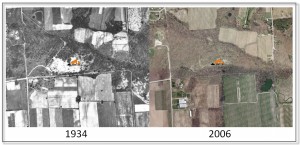
Figure 1: Two images of a historic landfill location discovered by comparing a 1934 air photo and a satellite image from 2006
The problem I came across with older landfills, was that they had been established, filled, and buried before record keeping was deemed necessary- at a time when location analytics did not exist. Therefore, even though I was able to establish a location using historic imagery, very little was known about the landfills, making them difficult for an inspection body to prioritize.
One day, while conducting research, I stumbled across previous efforts to map sensitive, environmental features, and a different methodology for evaluating the landfills occurred to me. With minimal data available, I realized the most effective way to appraise the state of a landfill would be to assess the surrounding environmental and social features that have the potential to be negatively impacted. In applying this approach, I discovered each of the landfills could be prioritized by examining the potential for the landfill to contaminate proximal, sensitive features. Pairing this information with the known history of a landfill allowed for an inspection plan based on a more relevant assessment of risk.
Choosing the Layers
I began by going through datasets for the region, identifying environmental, and social, features with the potential to be impacted by the release of contaminants from a landfill. As landfills can leach hazardous materials, I identified features such as soil permeability, well records, rivers, streams, wetlands, and water bodies as environmental receptors susceptible to landfill contaminants. I also took into consideration the fact that as the material in a landfill breaks down, it produces methane gas. Identifying social features that could be impacted, I selected residential areas, schools, and healthcare centres.
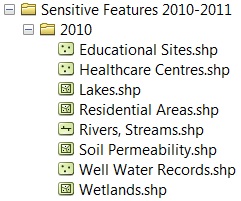
Figure 2: Environmental and social sensitive features used in analysis
With eight features selected and ready for comparison against the location of the landfills in the region, it was evident that a Weighted Overlay was the ideal tool to conduct such an analysis. Before I could jump into the analysis, I knew I had to take into account the proximity of these features to the landfills. To do so, I needed to consider that a landfill within a certain distance of a wetland, lake, or school, may still have the potential for negative impact. I looked into the legislation and approval process for various facilities that have the potential to contaminate ground water, and discovered such sites need to be at least 120 meters away from water features. I also looked up the construction setback guidelines for hospitals, schools, and residential areas, and implemented these buffer distances accordingly.

Figure 3: Example of setback distances for rivers and water bodies
The final step before conducting the analysis was to determine each layer’s importance in the Weighted Overlay. To assist in this process, I contacted an environmental specialist in the region to advise me. Each feature was then assigned a specific weight for analysis.
The Analysis
It was now time for the fun part. I began by using the Euclidean Distance Tool to convert the vector features into rasters, so that they could be used by the Weighted Overlay tool. Since some of the sensitive features had multiple setbacks, with varied associated weights, the next step was to use the Reclassify Tool to assign individual values to each feature and setback, in terms of importance. In order to perform arithmetic operations on rasters that originally held dissimilar values, ‘scale values’ were assigned to the features and their relative setbacks during this step, with a value from one to nine. The higher values represented areas with greater sensitivity towards landfill contamination.
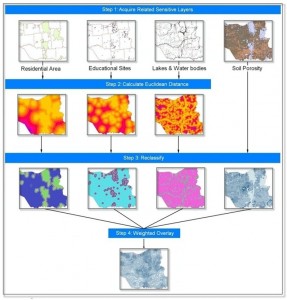
Figure 4: Flowchart example of how layers were process during analysis to produce the sensitivity layer
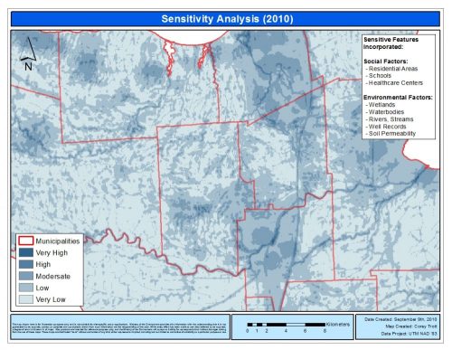
The Result
The final map, shown below, displays the varying level of sensitivity in the region pertaining to landfills. Darker areas on the map represent a location where a number of sensitive features have accumulated in close proximity, causing the area to be more sensitive. These areas have the potential to experience greater impact if contamination from a landfill occurred.
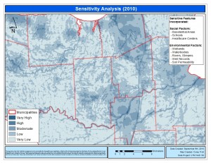
Figure 5: Map of the sensitivity layer where darker blue represents more sensitive areas
The next step of the project was to overlay the locations of the landfills on the map, in order to visualize which landfills stand out as having the highest potential to negatively impact their surroundings. Landfills that stand out with high sensitivity can then be assessed in terms of the individual, sensitive features within close proximity. Unfortunately, due to the sensitivity of government data sets, I can only display maps with data that is available publicly.
Although it is great to be able to visually identify the landfills that are positioned on more sensitive locations, to prioritize a long list of inspections it was necessary to take it one step further. Using the ‘Extract Values to Points’ feature in Spatial Analyst Tools, I was able to extract the individual sensitivity value for each location, and amend it to the original landfill program spreadsheet to support informed decision making.
When I presented the findings to my manager and supervisor, they were thrilled with the results. They were now able to identify which landfills in the region had the potential to negatively impact their surroundings. By combining this information with individual compliance history, and local knowledge, we were able to assess risk much more accurately. (Note: Risk = Likelihood x Consequence; the pollution source and compliance history feeds into the likelihood side of the equation, while the sensitivity information allows us to establish a consequence.)
At the end of the project I had completed something that I not only really enjoyed working on, it could also be recreated for other program areas as an effective methodology for determining environmental and social consequences, as related to a potential risk from a given contaminant.


Great article Corey. Can you tell us what region you were working in or is that too sensitive? I think what you’ve done here is excellent. A perfect example of how we as GIS experts can use our tools to help decision makers make informed choices. In this case, creating a plan of action for inspection.
A question. Did any other types of analysis using GIS tools occur to you or was this the only way to get the answers you were looking for? I ask because I wonder if you came up with a few different ideas and then settled on this one as the best method.
Hi Jonathan,
Thank you for your comment! Unfortunately when seeking approval to write this article, location was one aspect I was asked not to include.
Regarding your second question, I did consider other types of GIS tools to conduct the analysis. It came down to using the Raster Calculator or the Weighted Overlay tool. The reason I chose the Weighted Overlay tool was because it was a simpler method of setting scale values, and allowed the final results to be out of one hundred. Using the Raster Calculator tool to determine sensitivity would result in the final values being relative to the number of sensitive features included in the study.
Very interesting analysis.
Hi Corey! I am actually interested to do something like this as my 3 months dissertation for my masters.
May I know if the “Weighted Overlay” tool u mentioned is related to Analytic Hierarchy Process (AHP) in GIS?
And that I am only a beginner in GIS, so do you think 3 months is enough to complete this including write ups? Given that I will only look into one specific site of landfill instead of a broad area.
Kindly advice! Thankssss 😀