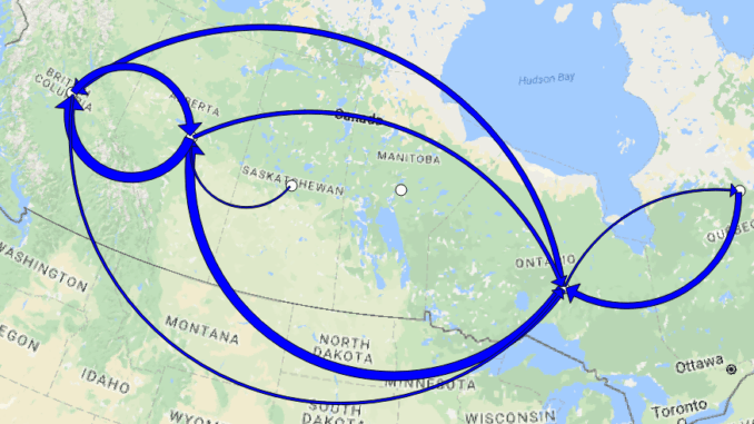
Flow mapping is a technique to visualize movement of objects of interest between geographic areas. Typical uses of flow maps could be traffic volume, trade balances, or migration. In this article we create flow maps to visualize migration flows between provinces in Canada.
In QGIS, the FlowMapper plugin provides functionality for flow mapping. The plugin wraps low level functions from Python modules such as PyQt4 to generate an interface and perform calculations that would take most of us a lot of time to do without such a plugin. Like many Open Source programs, the plugin was developed by someone who saw a need and used their skills to create something useful for the community.
FlowMapper takes three inputs:
- A text file that contains a matrix of flows from one geographic location to another
- A text file of coordinates that represents the center of each geographic location
- A text file of place names for each geographic location
For the matrix of immigration flows between provinces in Canada we use the table provided by Statistics Canada that records migration flows from 2012/2013 thru 2014/2015.

For the coordinates of each province we first put a vector layer of the provinces on a QGIS map, then use the Polygon centroids tool to create a layer of centroids.

Next we save the centroids as a CSV, removing all attributes from the CSV.

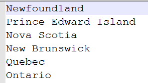
For the place names of each geographic area we simply create a text file of province names, making sure that the order matches that of the matrix and coordinate files.
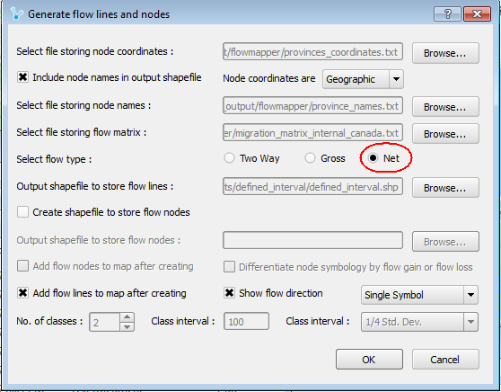
With our data sources in place we configure the FlowMapper dialog. For this example we select Net as the output flow type.
We can thin out the results so that only the greatest flows show. What pattern is apparent? Looks like everyone is headed west!

We are viewing the data with a predefined theme that FlowMapper provides, but we can do better. QGIS expert Anita Grasser has done work on theming flows like this, and using her techniques we can transform these arrows by applying three transformations:
- Make the width of the arrows data-driven. Each arrow’s width will reflect the magnitude of the flow
- Make the arrow heads larger. This helps particularly with arrows that have smaller flows
- Make a buffer at the beginning and end of the arrows, meaning that where the arrows converge they will not collide with each other.
You can get the details on how to do these transformations by going to Anita’s blog on the subject.
The result tells a more meaningful story of internal migration in Canada.
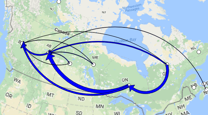
While we can still see that the direction is from east to west, additional details stand out:
- There are particularly large flows from Quebec to Ontario and from Ontario to Alberta
- There is a flow from Alberta to BC, but not as much as the other two flows
Does this flow map tell the whole story of migration in Canada? Not quite! Recall that we chose the Net flow type. The magnitude in this flow type represents the difference of flows between two provinces. It does not show the individual flows between provinces.
To display these individual flows, we invoke the FlowMapper plugin again but this time check Two Way as the flow type.

Thinning out the result again we see a different story.

The largest migration flow is actually from Alberta to BC, with a lesser flow from BC back to Alberta. Meanwhile the large flow from Ontario to Alberta dwarfs the flow back the other way.
Alberta in particular is the place to be during these years, undoubtedly because of the never-ending boom in oil prices. However, that boom came to a crashing end in 2015 and it will be interesting to see the migration flows in those years.
A close up of the arrows shows the effect of placing buffers at either end of the lines; you can clearly see where each line begins or ends.

The FlowMapper plugin and the additions by Anita Grasser show Open Source GIS at its best, creating tools and sharing enhancements to those tools to provide useful information about our world at no cost to the rest of us.



Be the first to comment