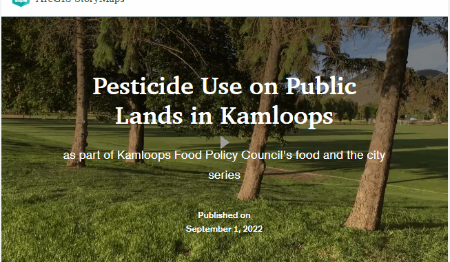
The beginning of the story
In the past summer, Kamloops Food Policy Council (KFPC) launched a research project to study a series of “Food and the City” policy topics and provide recommendations for the fall municipal election.
In this project, some interested KFPC network members researched different policy topics including housing, healthy ecosystems and pesticide use, transportation, etc. and presented their findings and policy recommendations to the mayoral and council candidates and the public. Read more about this project: https://kamloopsfoodpolicycouncil.com/food-and-the-city
The healthy ecosystems and pesticide use article explores the possibility of replacing pesticide use on public lands with healthier ecosystems in Kamloops. The research team aimed to employ a user-friendly tool to visually represent the history of pesticide use, where they are located within the city boundary, alternatives and action items to the public as well as future policymakers. ArcGIS StoryMaps and Instant Apps seemed great tools to convey important ideas as clearly and effectively as possible to technical or non-technical people. I was responsible for preparing the available data, creating an interactive map application and designing the story map.
This article hopes to explain the different sections of this story map and how to navigate the interactive map using clear and plain language for everyone with or without a mapping experience.
- Link to the story map: https://arcg.is/0yzObL
- Link to the interactive map: https://arcg.is/0KLXnC
This story map consists of six sections
The first three headings are the beginning of the story of pesticide use. These headers comprise the introduction of the pesticides, where and why they are used, how people are exposed to pesticides and their effects on humans and the environment.
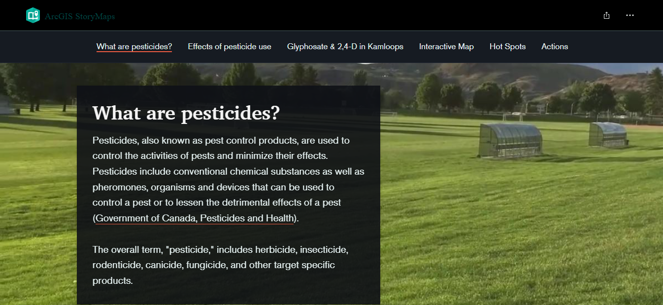
As this story map concentrates on Glyphosate and 2,4-D, the rest of the story narrates more detailed information and the city rules and plans related to these two pesticides as well as where they have been sprayed in Kamloops in 2021.
The next two headings are about data and mapping
Interactive Map
The interactive map section provides a link to an ArcGIS Instant App for users who wish to navigate the whole interactive map and explore the sprayed spots.
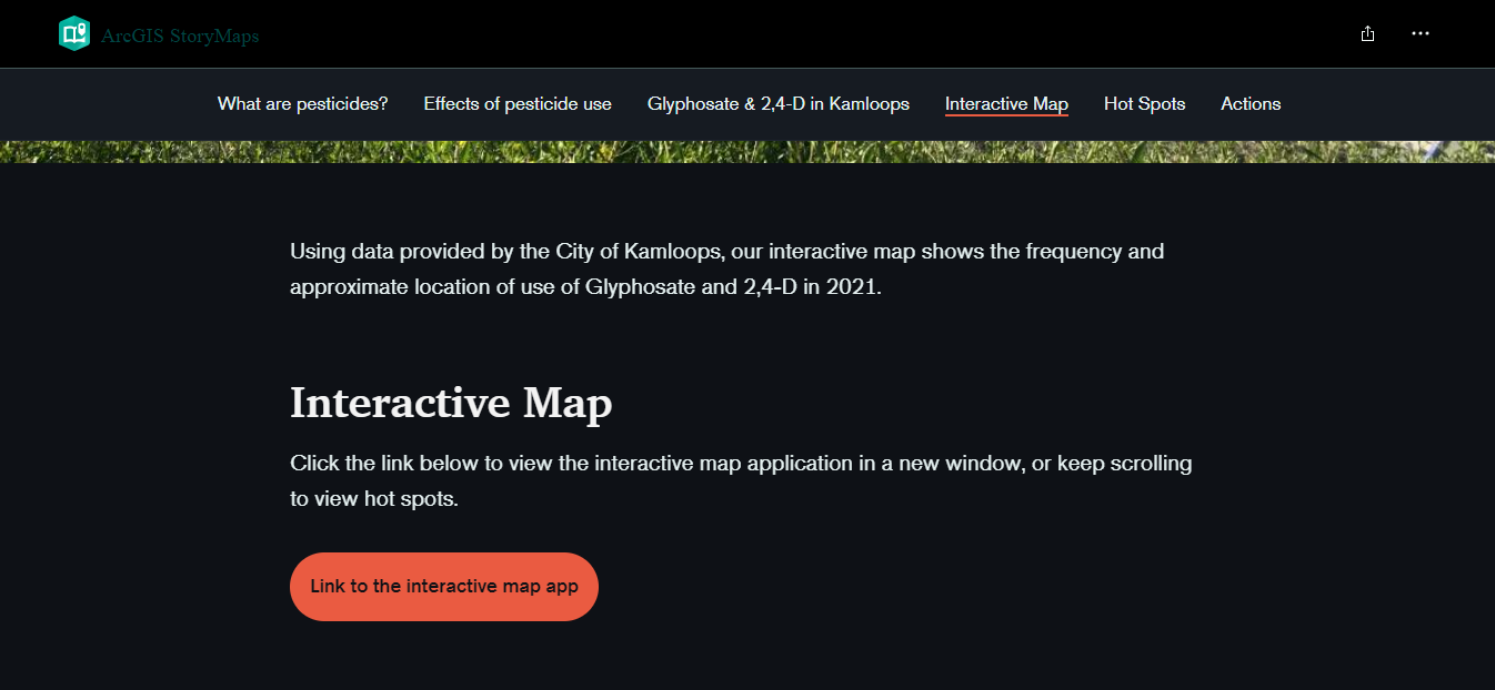
When you click on the provided link, an introduction panel pops out showing the application quick-start guide.
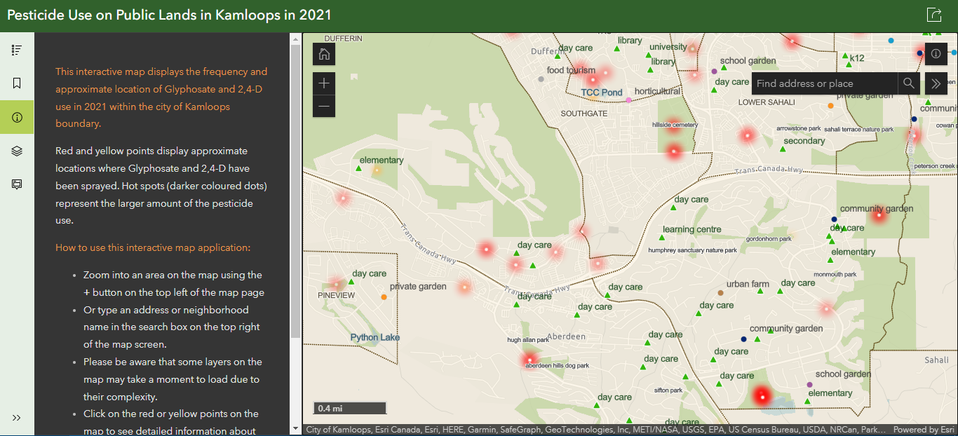
After you select the “Okay” button, a map view appears on the right side of the application. It displays the city boundaries, neighbourhoods coloured in light brown, natural features such as rivers and parks and red and yellow dots representing approximate locations where the pesticides have been sprayed in 2021.
On the grey left panel, the map details and instructions are provided. The legend of the map is located on a narrow ribbon at the top left side of the application.
Residents might be curious to know if the two pesticides have been sprayed near their neighbourhoods, their children’s schools, community gardens where they plant fruits and vegetables, farmers’ markets and more.
By zooming in, more features appear on the map, such as the name of neighbourhoods and parks, coloured circles as community food assets and green triangles as education centres for children and youth. Users can also type an address or neighbourhood name in the search box on the top right of the map screen. By clicking on the red or yellow points on the map, a panel emerges from the left side of the application. It contains detailed information about the use of pesticides such as active ingredients, quantity used and more. Users are able to compare pesticide use in different locations using the quantity used indicator.
The short video below shows a tour of the interactive map application. Link to the interactive map: https://arcg.is/0KLXnC
Hot Spots
The hot spots section in the story map gives an overview of the larger amount of pesticides use on public lands in the city in 2021. It is created with ArcGIS StoryMaps Sidecar, an immersive block with media panel and narrative panel. This section includes a simple how-to-use instruction and seven maps representing hot spot locations. The maps are interactive but not navigable. The non-navigable maps seem to load faster than regular maps in the story map. They are simple and easy to use especially for people with no mapping experience.
How to make a map non-navigable? When you add a map to the Sidecar block, Adjust map appearance window shows up. In the Options tab, under Map configuration, you are able to turn off the “Allow map navigation” option.
The video below provides a quick tour of the Hot Spots section of the story map.
After exploring the hot spots and interactive map, some questions might rise up for residents such as: Is there any alternative to these pesticides? What are the next steps? Can we help reduce the pesticides quantity used on public lands? The rest of the story map is designed to respond to these questions and provide an overview of the next steps.
This story map seems a great platform to engage the community in the decision-making process by raising awareness about pesticides, visualizing the data for better understanding and providing some recommendations and action items to support a healthier ecosystem in the city.





Be the first to comment