Awareness for climate change has been steadily increasing ever since the Green Revolution in the 1960s. There is a plethora of data, maps, and Geographic Information Systems (GIS) applications available freely or accessible to the general public.
Throughout my time at school and at work, I have come across various maps and applications regarding GIS and climate change, and in this article I have ranked the top ten that stand out to me.
In this ranking, I have considered: user-friendly interface, accurate data usage and whether it meets basic cartographic standards. The following are my top ten climate change maps and GIS applications:
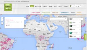
1 Global Forest Watch Climate Map by Climate Analysis Indicators Tool (CAIT)
CAIT is developed and maintained by the World Resources Institute that provides free and open source data on climate and greenhouse gas (GHG) emissions. Global Forest Watch Climate map displays the climate impacts of tropical deforestation, and carbon emissions. This interactive and high-resolution 30-meter map is built off of Google Earth Engine. The user has the ability to customize the map by adding base maps, year of data, the carbon emission values, tree coverage, data layers, zooming in or even selecting a jurisdiction within the mapped out area.
What I really admired about CAIT is that by clicking on a selected country it directs the map user to another page where they can find more data displayed in graphs and charts. Overall, I felt CAIT Climate Change Map is really impressive, user-friendly, and the customization option makes gathering or displaying data on climate change hassle-free. Another impressive element to CAIT is that they allow the user to freely download the data and tools. In my opinion this map is one of the top maps on this lists.
2 Esri’s Global Footprint Story Map
Second on the list is Esri’s Global Footprint Story Map created by Global Footprint Network – an international nonprofit organization. This organization works with businesses, governments, and individuals to provide predictions on the future of managing natural resources. As one of their projects, Global Footprint Network has created an Esri Map Story to visually show the global comparison of each nation’s bio-capacity versus its ecological footprint. This map indicates that humans are spending more than what nature can renew; the nations in green are the “creditors,” and the red nations are the “debtors” who are demanding more from nature.

I felt that the Esri’s Global Footprint Story Map is very complex, because one must have a basic understanding in economics or environment to understand the message that is being conveyed. Despite this, the story map does a great job with allowing the user to personalize and manipulate the map to retrieve the appropriate information. In addition, I was very pleased to see the story map allowed the user to navigate to each country with a side window pop up providing statistics, rather than being redirected to another webpage.
3 Sea Level Rise Viewer by Office for Coastal Management
The Sea Level Rise Viewer is produced by the National Oceanic and Atmospheric Administration (NOAA), and provides coastal managers or scientists with a preliminary look at sea level rise and coastal flooding impacts. At first glimpse of the application one will notice there are five tabs for the layer options that appear on the left hand side. These five tabs or layer options are: sea level rise, local scenarios, marsh migration, vulnerability, and flood frequency. This application does well in terms of being user-friendly, while also providing the user with plenty of retrievable data. I found the feature of providing a brief description for each data layer to be very useful. It was also very handy that the map could change its layout depending on the device the user uses, in addition to giving the user the ability to download the data layers or elevation models.
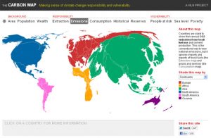
4 Carbon Map by KILN
KILN, the creator of the Carbon Map, is an award-winning data visualization company that works on presenting data by using different visualization and storytelling platforms. The idea behind this interactive map is to convey the countries that are contributing to climate change through analyzing pollution and greenhouse gases (GHG) emissions. An interesting component to this map is that it purposely gets distorted depending on the type of data value you choose. The data values can vary looking at consumption, emission or historical rates. The user can further analyze the map by providing brief statistics on each country, but is nothing to extent of the Global Forest Watch Climate Map. Another downside to this map is that there is no zoom in and out button.
5 Air Pollution Map by Yale University
A team of Yale University environmental researchers have created an air pollution map that shows the concentrations of fine particulate matter (PM2.5) across the globe. The map draws on satellite measurements to calculate average particulate matter for each country, and helps to visualize where in the world the most polluting power plants are located. There are three main tabs at the top of the map that enables the user to customize the map: show cities, satellite date, and power plants. While moving the cursor on top of the countries, it provides the user with the average PM concentrations of the country.
I was disappointed with this map because there is little to no tools that allow the user to customize it, or to see more statistics on each country in addition to just presenting the concentrations levels. Overall, with the enormous amount of scientific research behind the Air Pollution Map and the precise concentrations of PM2.5 this map has been placed in the middle of the list.
6 Google Earth Engine and Timelapse Video
Google Earth Engine is a powerful tool for analyzing geospatial information, and is a catalog for satellite imagery or geospatial datasets. This earth engine allows anyone to use it for various applications, and provides advanced programming interfaces (APIs) in javascript and python. An example of the magnitude of how powerful Google Earth Engine is, is their timelapse video. The timelapse video is a collaboration with the U.S. Geological Survey (USGS), NASA, and TIME; where the video shows the change of landscapes of the planet. The video allows the user to zoom in, search, or pan into a particular area to see the urban landscape change from all the way back to the 1970s. With little to no features allowing the user to customize it and limited space to work within it, the timelapse video has been ranked as number six on the list.
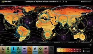
7 The Met Office Four Degree Interactive Map
The Met Office Four Degree Interactive Map was created in 2007, when The Intergovernmental Panel on Climate Change (IPCC) published the Fourth Assessment Report. This map provides examples of where the forest fires, agriculture, water availability, sea level rise, marine life, drought and weather patterns will be transformed when future temperature increase 4 degrees Celsius. Upon initial look at the interactive map it looks very busy and complex; there are multiple tabs at the bottom, multiple rings around countries, and a legend on the right-hand corner of the map. But once the user begins working with the tools provided and clicks on the pop up buttons in the map it becomes more understandable. Another useful addition is that it enables the user to use Google Earth Engine as a platform, by first downloading the Met Office global temperature layer. With that being said, the versatility of being able to transfer the data to other tools and applications has brought The Met Office Four Degree Interactive Map near the bottom of this list.
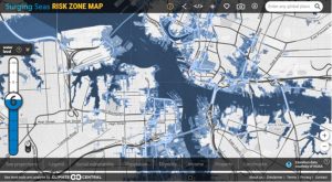
8 Risk Zone Map by Surging Sea
Risk Zone Map can be located on the Surging Sea website. Risk Zone Map is Surging Sea’s only non-profit tool that allows the user to globally search by city or postal code to show results for vulnerable areas that are predicted to be permanently submerged from sea level rise in the future. This map is based off of a peer-reviewed article called “Tidally Adjusted Estimates of Topographic Vulnerability to Sea Level Rise and Flooding for the Contiguous United States” by Benjamin H. Strauss, Remik Ziemlinski, Jeremy L. Weiss, and Jonathan T. Overpeck. The Risk Zone Map shows digital elevation models that are put together to determine the total coverage of the global coast and to provide precise data to the user.
Some of the things I admired about this map is that there is a good selection of data layers one can chose from, projections can be changed to the user’s liking, and the data is considered to be reliable as it has been thoroughly researched. Another feature I liked about this map is it allowed the user to download the map image they created from the findings they have retrieved. Risk Zone Map has been ranked eighth because there was no pop-up windows that gave statistics on the data that was gathered, or an introduction video explaining how to work it.
9 World Air Map by Plume Labs
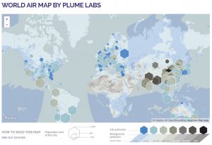
Plume Labs is an organization that brings awareness on pollution and having cleaner air. Mapbox and OpenStreetMap have collaborated together to help Plume Labs create a live map of air pollution for earth. Information has been gathered from various levels of governments worldwide, in addition to open data environmental measurements from 11,000 stations. I found this map to be really great and would be useful for the average citizen when they wanted to retrieve live and reliable data. On the downside, I felt the colour coding of the map was poorly chosen because it was hard to differentiate between the Plume Index.
10 Migrations of Motion Map
The Migrations in Motion Map was developed by The Nature Conservancy and researchers from the University of Washington, which includes the base map provided by Mapbox and OpenstreetMap. It explores the idea that climate change will alter habits or destroy ecosystems, which will causes animals to move around to survive. The Migrations in Motion map displays the average and predicted direction for approximately 2,954 mammals, birds, and amphibians.
At first glance, this map is very basic looking with bright coloured lines moving in every direction of the Western hemisphere. I thought this map was hard to navigate because it took a while to load. It would have been more interesting if the migrations were not only subjected to the Western hemisphere. On a positive note, I thought the actual map was visually appealing and easy to read. The map is left at the bottom of this top ten list because compared to the other maps reviewed, it does not allow the user to interact or manipulate data, and is limited to one side of the world’s hemisphere.
Please comment below, if you feel there are other outstanding climate change maps and GIS applications that should have been included in the list.


Be the first to comment