
As the 2016 United States presidential election careens towards its conclusion in November, GIS plays a prominent role in both planning political strategy and in describing the results of the contest. Media outlets create maps and graphs to predict outcomes and to describe campaign activities, while political parties use specialized election software to help them aggregate data and to plan their various initiatives.

Commercial GIS vendors are well aware of the thirst of political parties for mapping capabilities and tout the strategic value of obtaining and understanding every tidbit of geospatial information. ESRI offers applications for such purposes as mapping election results, redistricting, and locating polls while Polis provide software that promises to automate “walk routes, data capture, and results tracking” so that the user can “spend more time connecting with prospects and less time doing administration”. (Polis, 2016).
Of course, these applications are not free, and are thus more accessible to well-heeled campaign offices. But GIS analysis with Open Source software and hybrids of commercial/free software (such as Carto) is also possible.
Karsten Vennemann, an Open Source GIS (OS GIS) professional currently based in Seattle, was one of the contractors for the Obama for America Campaign during the 2008 presidential race. Terra GIS’s website has a brief description of some of the Open Source GIS technology Karsten worked with, such as the venerable UMN MapServer, the powerful PostGIS, and the robust JavaScript mapping interface, OpenLayers, These types of technology work great for large organizations staffed with highly-skilled GIS analysts and web developers, who often work in teams- but are sometimes out of reach for the average GIS user. What type of OS GIS technology is available for individuals or for small organizations with modest technical capabilities and budgets?
In their excellent book, QGIS Map Design, Anita Grasser and Gretchen Peterson outline a method anyone can use, called “value by alpha” to display results of the 2012 US presidential election. The result shows not only which member of the Electoral College won a given electoral district, but also the number of presidential votes obtained by the Elector in that district.
The total number of presidential votes made is an important attribute because the US President is not elected directly, but voted for by “Electors” who must obtain the majority of the total number of presidential votes in their state, in order to be allocated all of the presidential electoral votes for that state. (Note, this is an oversimplification of the voting process, but is true for the most part—see https://www.usa.gov/election for a more complete description).
Bivariate mapping involves the display of variation in two attributes simultaneously by adjusting two types of visual cues at the same time. How do you display two variables on a map? Some maps do it by making a cartogram. A cartogram deliberately distorts features to make a statement about some attribute.
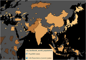
In the Indemapper cartogram the countries are distorted according to their population, with India looker much bigger than it actually is. The second variable is life expectancy, with lighter colour representing greater life expectancy. The problem with this technique is that it may distort objects so much that they become unrecognizable.
In the QGIS Map Design example, the authors use the colour functions of QGIS to add an alpha layer to a map that shows 2012 election results for the state of Minnesota. The first variable shows which candidate, Barack Obama or Mitt Romney, won each electoral district. The colours are either blue for the former or red for the latter. Adding an alpha layer, controlled by the magnitude of the second variable (the number of votes from the area), modifies these colours by making them brighter or darker.

As shown, Romney won a lot of districts on the periphery of the dense Minneapolis / St. Paul area. However, many of those districts have a small population relative to their size. Obama won many districts in the core of this area. In the end, Obama won Minnesota with 52% of the popular vote.

The alpha effect is achieved by making rules in the style editor of QGIS. The styles are applied sequentially, so that the final style (the one that says “no filter” in the screenshot) modifies the other styles.

Examining this style, we see two QGIS functions at work, scale_linear and color_rgba. The ‘scale linear’ function returns a value between 0 and 255 depending on the result of the calculation of the total votes of the district divided by the area of the district. Districts with low population and large areas will have a smaller number as a result.
The ‘color_rgba’ function uses this value to output transparency. The smaller the number, the darker the district will be. The higher the number, the brighter the colour will be, regardless of whether that colour is red or blue.
QGIS has a sophisticated catalog of functions, and the colour functions are just one component of a much wider set. The Minnesota 2012 election results map provides a shining (you might say, transparent) example of the potential of QGIS to perform sophisticated cartographic styling. Now even the poorly-heeled citizen with no change in his pocket can use GIS technology to promote their cause in an election environment.


Be the first to comment