
- Canada will be Launching a Satellite to Monitor Wildfires
- Canadian Housing Market
- Heat Island Effect in London, Ontario
- Esri Canada Acquires Ratio.City
- Vancouver Transit Time
As wildfires worsen, Canada’s space agency wants to become firefighters’ eye in the sky
Currently, both provincial and federal wildfire agencies have to rely on the European Space Agency’s Sentinel satellites and NASA’s Aqua and Terra satellites to assist in monitoring and predicting the behaviour of wildfires. This is set to change in 2029 when the Canadian Space Agency launches the world’s first public satellite for monitoring wildfires. When launched, the satellite WildFireSat will reduce Canada’s reliance on other nations for wildfire monitoring and will help monitor harmful levels of smoke and air quality. This data will not only benefit Canada but will also aid many other countries by providing quick and accurate information.
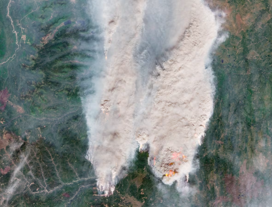
Donnie Creek Wildfire on May 18, 2023, captured by the European Space Agency’s Copernicus Sentinel-2 satellite. Source: ESA
Article can be viewed here
Canadian Housing Market News
An interactive map shows the average housing prices by province along with the monthly and annual price change as of August 2023. The article provides detailed information on the housing market, including average rent cost, price fluctuations, real estate transactions, and home prices categorized by region. According to the latest report, home prices in Saskatchewan have decreased in the past 12 months. In contrast, all other Canadian provinces have seen an increase in home prices, with the highest annual price change recorded in New Brunswick at 13.7%.
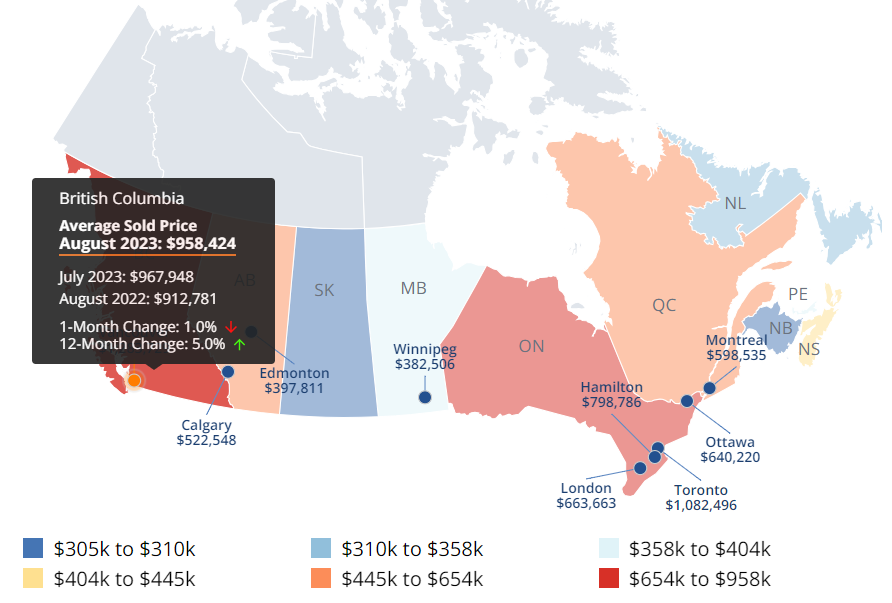
An interactive map showing the average home price in each province. Source: VOMA
Article can be viewed here
Where extreme heat stifles London’s neighbourhoods most — in maps
A team of researchers from Western University has created a series of maps that illustrate the areas in London, Ontario that are most vulnerable during extreme heat events. Heat maps can be a valuable tool for city planners to identify areas within an urban environment that are most affected by high temperatures. By using these maps, planners can make informed decisions to create cooler and more comfortable public spaces for the community. The maps show that downtown London is the hottest area due to the concentration of heat around high-rises, malls, parking lots, factories, and surfaces that are better at absorbing the sun’s rays. In contrast, areas outside the city centre that have plenty of green spaces tend to be much cooler.
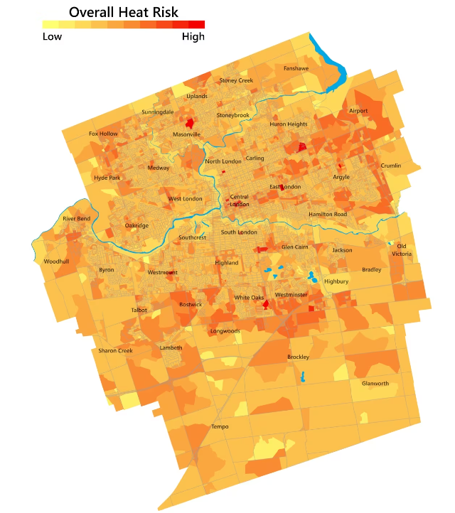
Overall heat risk in London, Ontario. Source: Karols Lao/Western University
Article can be viewed here
Esri Canada acquires Ratio.City to help address Canada’s housing crisis
Esri Canada has acquired Ratio.City, an urban planning software and data company based out of Toronto. This acquisition aims to expand Esri Canada’s portfolio of community planning solutions, enabling improved collaboration in the land development and planning sector, and expediting the design and approval of cost-effective housing solutions.
Article can be viewed here
Colourful map makes it easier to understand Vancouver transit times
An interactive map was created by University of Waterloo student Henry Nguyen to monitor transit times in Vancouver, Toronto, Montreal and a few other cities. This interactive map allows you to double click to select a starting location and select a mode of transportation, including bus, subway, tram, train, or ferry. The user can also input a starting time and maximum trip duration.
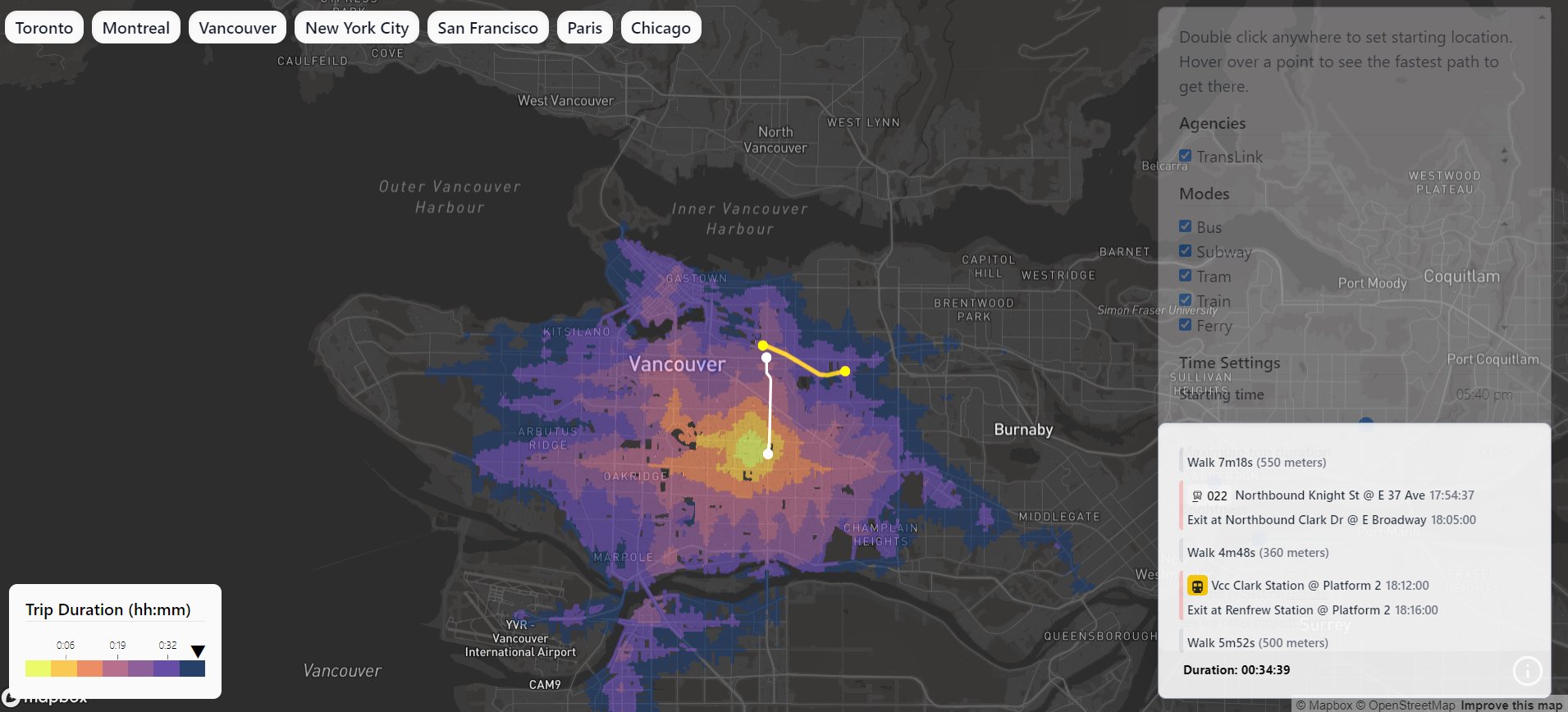
Map showing transit route and time from the start location. Source: map.henryn.ca
Article can be viewed here




Be the first to comment