
When we look at a map, it feels like we are seeing the world as it is. Oceans, continents, and countries laid out neatly on a page or a screen. But every map is a choice. Behind the lines and shapes is a decision about projection, and that decision shapes how billions of people imagine the world.
The Power of Projections
Flattening a round earth onto paper has never been simple. Projections were developed as tools to serve particular needs. Some were designed for sailors navigating the seas, others for scientists studying patterns across regions, and more recently for web mapping platforms that help us find the nearest coffee shop.
Each projection comes with trade-offs. Some preserve direction, others preserve area, others preserve shape. Cartographers have always understood this, but the general public often assumes the world map they see hanging in a classroom or appearing on Google Maps is “the real one.” That is where representation becomes critical.
Why Representation Matters
For those in geomatics, the projection chosen can influence how data is interpreted, how decisions are made, and how policies are shaped. For educators and cartographers, it influences how the next generation thinks about space and scale.
The most common example is the Mercator projection. It is the map that many people grew up with, where Greenland stretches across the top of the globe looking nearly the same size as Africa. In reality, Africa can fit fourteen Greenlands inside it. Europe and North America appear much larger than they truly are, while Africa and South America are reduced.
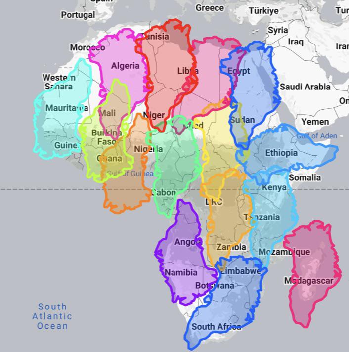
These distortions are visual quirks, as well as shape perception. A continent shown as smaller than it is may be imagined as less significant, while others appear dominant.
The Mercator Projection
The Mercator projection was created in the 16th century to support navigation. For that purpose, it worked exceptionally well. By preserving direction, it allowed sailors to chart straight-line courses across the oceans, which made it invaluable during the great age of exploration. Even today, it remains useful in certain settings, such as digital mapping platforms, where maintaining local shapes and angles supports navigation.
Over time, though, Mercator grew far beyond its original purpose. It became the default world map in classrooms, offices, and global institutions. Its familiarity has kept it in place, but it was never designed to show the relative size of continents accurately on a global scale. That limitation is what continues to drive the call for alternatives.
A Step Toward Better Representation
In 2018, cartographers introduced the Equal Earth projection. This projection was designed to give a fairer view of the continents, restoring the scale of Africa and South America while still keeping the overall shape of the world recognizable.
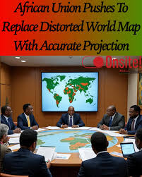
The Correct the Map campaign, led by Africa No Filter and Speak Up Africa, has been calling for broader adoption of Equal Earth. Earlier this month, the African Union officially endorsed the campaign Reuters report. The AU encouraged schools, governments, organizations, and individuals to consider moving away from Mercator as the default projection.
The campaign provides resources for those interested in engaging:
- Petition for individuals: Sign here
- Commitment for organizations: Pledge here
- Equal Earth map download: equal-earth.com
Why this Matters
For geomatics professionals and cartographers, the choice of projection has practical as well as symbolic consequences. Maps influence analysis, public communication, and education. Using projections that better reflect true scale can support clarity, fairness, and trust.
Some institutions have already made adjustments. The World Bank, for example, uses Equal Earth or Winkel Tripel for its static maps, and is gradually phasing out Mercator in its digital versions Reuters report. The African Union’s call adds to the momentum around reconsidering defaults.
Maps are tools for navigation but they also tell stories about the world and our place in it. The decision by the African Union to back the Correct the Map campaign highlights the importance of questioning the standards we use.
For cartographers, educators, and geospatial professionals, this is an opportunity to reflect on whether the projections we rely on still serve the needs of today. The choice of projection will always involve trade-offs. What matters is being deliberate about those choices and the messages they send.

Great Piece. Very interesting on the history of the use of projections and how they became almost default views of how people see their world.