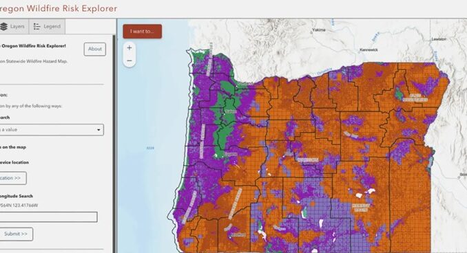
I came across an article a few weeks ago that seemed like a curious case of overreaction, but it pointed to something deeper about how people respond when trust in information breaks down. At first, it simply seemed like a weird situation. A map created to save lives was withdrawn due to public pressure. But the more I read, the more it felt like a snapshot of something bigger. We are at a time in which information moves fast, and even something grounded in science can be made a political lightning rod.
Following Oregon’s 2020 wildfire season, state legislators sought to create a wildfire hazard map that would display the level of risk for all properties throughout the state. The goal was to determine where the risk is greatest to help people prepare and protect their homes, as well as to inform future building codes and safety protocols.
When the map was released in 2022, many homeowners felt threatened. Homeowners were sent letters stating their properties were in high-risk zones, which many were unaware of. There was no prior notice and no effort to explain and transition. Just a letter and new policies.
The timing couldn’t have been worse, as insurance companies were simultaneously suspending coverage or raising premiums for thousands of homeowners. Insurers said their efforts were based on their own assessment of risk, but homeowners blamed the increases on the new state map. The narrative had already taken hold, and the rumor spread quickly.
Misinformation spread like wildfire. A Facebook group opposing the map attracted thousands of members. Some claimed that the map was a government conspiracy to get rural citizens to vacate their homes. Conspiracy theories about Agenda 21, a baseless theory of international elites pushing people into cities, grew rapidly. Local talk show hosts aggravated the situation and fanned the flames of fear and anger.
Worst of all was the lack of clear communication from state officials. Chris Dunn, the fire scientist who helped create the map, suggested that strong public education and messaging were needed before releasing it. What the state did offer was a one-page overview of agency obligations. Homeowners were first notified of their risk classification in a letter several months after the map was completed.
The backlash reached a point where public meetings were postponed due to threats of harm. The state tried to counter it: changing the language on the map to be less controversial, adding public meetings, and increasing online resources, but the damage was done. The mistrust and disinformation were already in place.
By 2025, even some scientists and lawmakers who had been pro-map began questioning its usefulness. They conceded that the model could not account for the individual conditions of each property. There was political pushback, and it was repealed in a swift fashion. Oregon officially derailed the wildfire map and related home protection rules in a near-unanimous vote in July 2025. Only one lawmaker, a firefighter familiar with the true danger, voted to save it.
For us who work with maps, this is a warning. It is not sufficient to have good data and solid science as how people understand and receive that information can make a map succeed or fail. Maps are created from data, and themselves will always be neutral, but how those maps are used, interpreted, and communicated is not always neutral. The decisions about who uses them and the context of how the information is portrayed can shape how people receive and react to the data.
The Oregon wildfire map showed us that when people lose trust, even the most accurate and well-meaning tools can quickly become symbols of fear and frustration. This reminds us that clear communication and building relationships with the people we serve are just as important as the data we create.


Be the first to comment