
The GoGeomatics editors, writers and online managers discuss stories each week that we would like to share with the community. Once a week, we get together online and discuss the biggest stories in Canada and around the world and share that here. That’s how we create the Canadian and International news digests. We discuss and vote on what we want to share.
Last month we published what we believe is the big news story from 2020 for Canada’s Geospatial Sector. That is the big push for Canada in Space and our space industry.
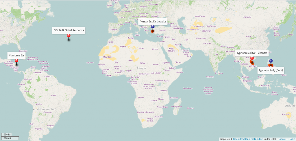
On the international side after some discussion, we agreed that the use of geospatial tools, services, and data fighting the global covid epidemic is the International news story of 2020.

How did Geospatial Tech impact the fight of our lives?
2020 started with a pandemic that quickly moved across the globe and has made the rest of the year a misery for many of is. The world was caught off guard but for the geospatial community our tools, data and services became instrumental in the global fight against COVID.
The global geospatial initiatives against COVID-19:
Drone technology helps provide resources to isolated, remote communities during COVID-19
Saeideh Hejazi: In the face of the COVID-19 pandemic, drone technology has been utilized in many countries to deliver medical and non-medical supplies and services to remote areas and high-risk zones. Drone technology was a useful geospatial tool for the Government of Rwanda in sending prevention awareness messages to difficult-to-reach communities. These communities were not following COVID-19 orders such as wearing masks or stay at home. The drone cameras also recorded footage used to help local authorities closely watch neighbourhoods and identify areas for evacuation or intervention. Without using drones, this process would take longer. Read more: https://www.afro.who.int/news/covid-19-response-rwanda-use-drones-community-awareness

Humanitarian OpenStreetMap Team provide support during COVID-19: locate 1100+ handwashing stations
Tanya Tejassvi: HOT is an international team dedicated to humanitarian action and community development through open mapping. The team was requested to map susceptible and impacted areas in various countries. Another project worth mentioning is the mapping of invisible communities hit by COVID-19 in Indonesia. Hundreds of volunteers who otherwise mark roads and bridges on OpenStreetMap (OSM), added more than 1,100 handwashing stations across the country. This has underlined the importance of maps, that remain inaccurate and incomplete in many parts of the world, leaving more than one billion people “invisible”, according to HOT, which aims to map these areas in 94 nations in five years’ time. HOT is backing COVID-19 responses in 18 countries through mapping, including Peru where more than 10,000 volunteers have made nearly one million edits to the country’s map. To reach its goal of one million volunteers, HOT is giving microgrants in countries including Liberia, Kenya and Mongolia, and engaging with university students and youth groups.
While the pandemic was the focus of a lot of media coverage this year, many other natural disasters occurred and HOT responded to them while also maintaining active community mapping projects for Covid-19.
Powerful stories of COVID-19 loss and recovery from GISCorp
Lindsey Goncalves: One of the ways the world has banded together to fight COVID-19, inspiring others to do their part to drive cases down is by sharing stories of those who have been directly impacted by this deadly virus. Early in the pandemic, volunteers from GISCorp created a platform called Coronavirus Stories of Loss and Recovery. Powered by ESRI, people around the world have submitted a memorial or shared their own story of recovery. The submissions have been added to an interactive map. It has recently begun to include stories of those who have been vaccinated too. Check it out here: https://coronavirus-stories-of-loss-and-recovery-giscorps.hub.arcgis.com/.
John Hopkins COVID19 Dashboard
Jonathan Murphy: One of the first impactful and widespread uses of technology concerning the global pandemic was the creation of the Johns Hopkins COVID-19 Dashboard. It was so important that the creator, Ensheng Dong won an award for the work. The dashboard is used as a source for reliable information on the pandemic and shows the power of adding location information to analyze and communicate complex information. You can read more about the creation of the dashboard here.
Dr. John Snow mapped data from a cholera outbreak in London in 1854 and I’m sure he would be proud to see this effort today.

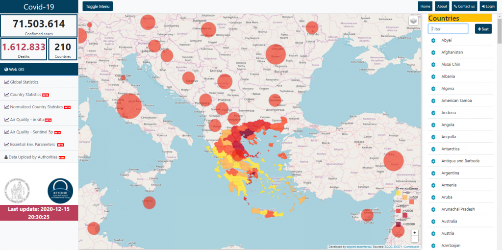
Athen’s Centre of Earth Observation Research and Remote Sensing provides updates, risk assessment and early warning for COVID-19
Celso Isidro: The Athen’s Centre of Earth Observation Research and Satellite Remote Sensing BEYOND platform is one of the flagship projects of Europe that presents geospatial updates about the COVID-19. Its vision, in addition to providing services on disaster management, is to deliver guidelines on risk assessment and to establish an early warning device about the virus development. The platform concept is based on open-source information from credible sources, utilizing technologies like Earth Observation (EO), big data and artificial intelligence (AI) to integrate and normalize them. The data compilation contains COVID-related figures and involves selected atmospheric and environmental parameters relevant to evaluating human health. These data are obtained from in-situ and through the Sentinel-5P satellite (TROPOMI).
The Web Portal showcases global geospatial information about the virus, in addition to data graphs and country statistics for those who appreciate data comparison and historical trends. The statistics featured in the portal are from the European Centre for Disease Prevention and Control (ECDC), John Hopkins platform and Worldometers. Meanwhile, its environmental parameters in-situ and EO-based monitoring are currently limited to cities of Greece.
Geospatial applications help fight COVID-19 in Low- and Middle- Income Countries
Paul Ajayi: Surprisingly, Geospatial technologies have been used widely across Low- and Middle-income Countries (LMIC’s) as dashboards and reporting tools to monitor COVID-19 spread. South Africa and Zambia particularly stand out. Although badly hit by the virus with the highest infection rates on the Continent, South Africa widely adopted ESRI powered dashboards and Google Data studio as COVID data visualization means. A dashboard highlighting Population vulnerability, Population health and the Health Care System with 26 layers of geospatial health data were the most informative. You can view the web app here:
In Zambia, the Spatial Data Infrastructure of Zambia and the Ministry of Health created an ESRI powered COVID-19 Data Hub and COVID-19 Dashboard to monitor national COVID Spread. Geospatial applications visualizing Social Distance, National Risk Index and Community Engagement Campaigns were published on publicly accessible GIS dashboards. These geospatial applications were vital for surveillance and informed COVID responses in these LMIC’s.
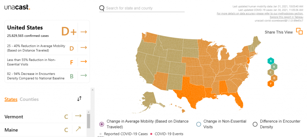
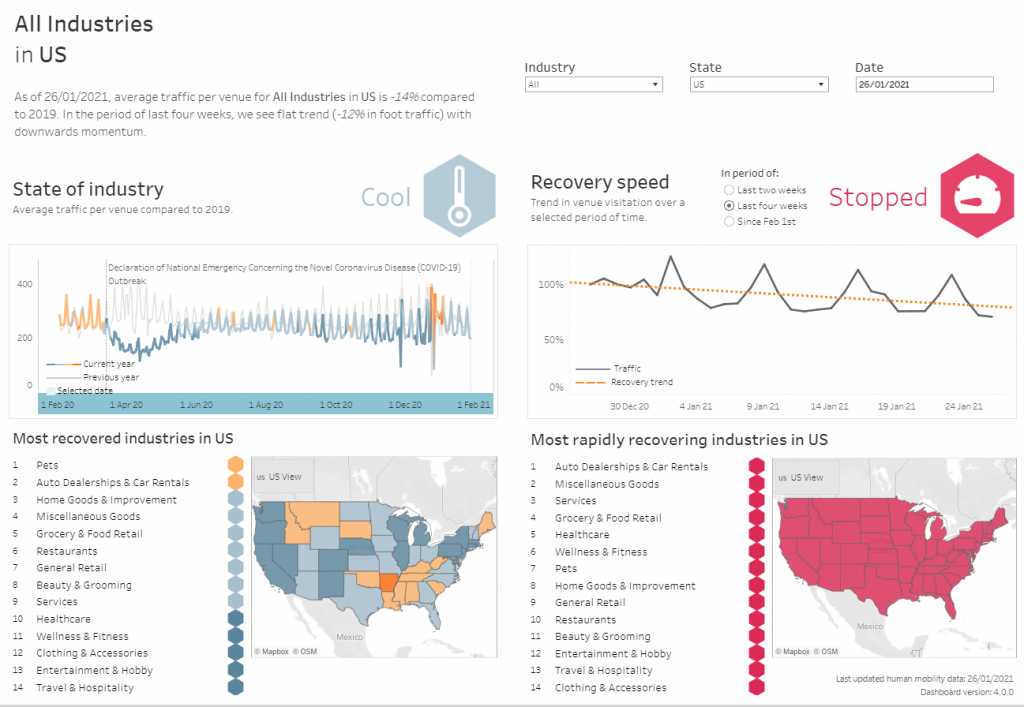
Unacast data insights and social distancing scoreboards create COVID-19 toolkit
Nick O’Hanley: Interesting uses of geospatial tools were developed by a human mobility data insights company – Unacast. Originally, the company used its tools around understanding how people move around the planet to provide spatial data to companies wishing to make better business decisions: For instance, understanding retail foot traffic, where to place marketing campaigns etc. They leveraged their data to build a COVID-19 toolkit.
The toolkit includes a social distancing scoreboard in which it uses their mobility data to analyze changes in mobility patterns to score states down to the county level. It also provides a retail impact scorecard where it compares current foot traffic within an area to pre-COVID times to understand the commercial impacts to different regions.
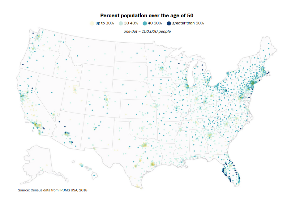
The COVID-19 Health Dashboard helps visualize at-risk populations across Canada
Jacob MacLean: One of the geospatial tools I found to be useful was the Canadian COVID-19 Health Dashboard. It helps visualize and understand where some of Canada’s most vulnerable citizens live. The team that created it used data derived for Statistics Canada’s Canadian Community Health Survey. The dynamic map changes to display the population within your area of view and includes information about how many people living in this area have some of the different pre-existing conditions that result in having a higher risk when it comes to COVID-19.
It also has an interesting use of adjusting layers based on scale. At the full extent, you can see case information broken down by province. As you zoom in, you can see the different public health areas across Canada and click on each of them to find case information such as total cases, number recovered, deaths, and in some health units, the number of people tested. At community scales, we can see a neighbourhood-by-neighbourhood breakdown of age demographics indicating high-risk areas with large populations over 70. This layer also helpfully includes locations and attribute information for a variety of health facilities. To explore this dashboard for yourself, click here.

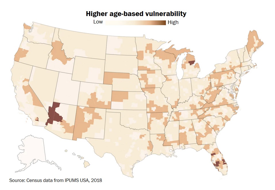
Rural areas may be the most vulnerable during COVID-19 outbreaks
Leo Poon: People from different backgrounds have had affected by coronavirus differently. Individuals may face various prevalence rates based on their age and location. To understand more about the disease, pathologists from the University of Massachusetts cooperated with the White House Coronavirus Task Force to find out who are the vulnerable populations and how Covid-19 would spatially infect them. The team suggests that elderly or sick people facing greater risk from standard flu will also be more threatened by the coronavirus.
According to the analysis, older dwellers living in rural areas would be at higher risk. Unlike those living within the metropolitan area, people who live far away from the city have a higher mortality rate if they are infected, due to long travel distance to hospitals and limited medical resources nearby. The information can assist local governments in setting up action plans when there are outbreaks in rural communities.
Reference:
https://www.washingtonpost.com/health/2020/03/19/coronavirus-projections-us/
These are just some of the featured efforts by our geospatial sector during the COVID-19 pandemic. As we have read about it, geospatial technology plays an integral role in influencing present and future government policies, which direct the implementation of on-the-ground solutions. We will be expecting more about this technology as we move forward on the succeeding years.
References:
https://www.esri.com/about/newsroom/blog/covid-19-global-geospatial-challenges-achievements/
http://beyond-eocenter.eu/index.php/news-events/265-etisis-ekthesi-beyond-2020
http://webgiscovid19.beyond-eocenter.eu/
http://geodoi.ac.cn/covid-19/en/index.aspx
https://covid19.spaceappschallenge.org/
https://covid-19.tn
https://www.unacast.com/covid19/social-distancing-scoreboard
https://towardsdatascience.com/geospatial-data-and-tools-for-analyzing-covid-19-9eaf298512

Be the first to comment