")
Maps Are the Medium. Stories Are the Point.
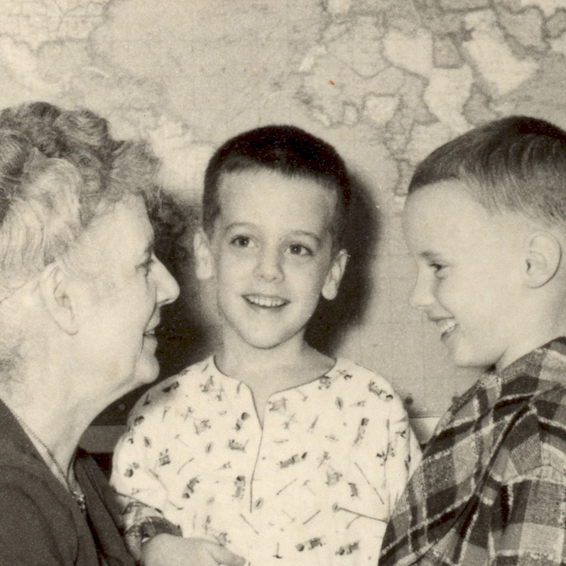 Before the software platforms, before the glossy atlases, there’s a photo. A little boy in pajamas sits between his brother and grandmother. Behind them, pinned to the wall: a world map. Allen Carroll remembers staring at it from his bunk bed, nudging continents together in his mind. He was four or five.
The picture opens Carroll’s book Telling Stories with Maps, and it tells you everything you need to know. This is a book that begins with wonder, not code.
Carroll’s book, Telling Stories with Maps, was launched on June 10 and is available on Amazon, Bookshop.org, and IndiePubs, among other retailers.
Carroll would go on to become Chief Cartographer at National Geographic and later, the creator of Esri’s StoryMaps — the platform used by researchers, journalists, governments, and everyday storytellers around the world. He’s spent a lifetime shaping how people see places.
And while the maps have evolved — from airbrush to interactive layers — the instinct behind them hasn’t. Clarity. Connection. A sense of where we stand.
The Book is Structured Like What it Describes
The way Carroll organizes his book feels deliberate, almost architectural. He starts small, with questions about how humans respond to stories, how memory and location are tied together in the brain, and why maps command attention even when we don’t think of ourselves as “map people.”
“Maps pack huge amounts of information into a form that most people find easy to interpret. The human mind has a remarkable ability to mentally project patterns on a page or screen onto the real world,” he told me in a recent interview. “As long as maps are carefully designed and not overloaded with detail (and that’s a pretty important qualifier!), they speak a visual language that’s almost universal.”
The early chapters are personal. He recalls childhood road trips, sketching floor plans, drawing his own neighborhood maps by hand, and later designing infographics for The Washington Post magazine.
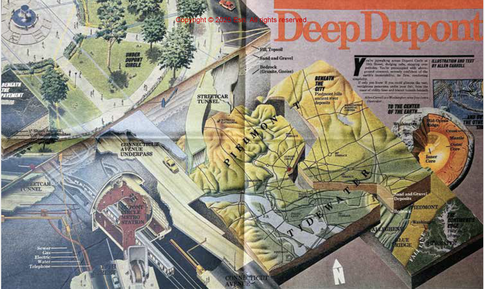
Once he pitched an idea to them: What lies beneath Dupont Circle (Introduction, xiii) that tangled roundabout in Washington, D.C.? The result was a six-panel vertical excavation, moving from the asphalt to the streetcar tunnels to the Metro system to the geologic provinces under the city — and finally, to the exact point on the Earth’s surface opposite D.C., somewhere in the Indian Ocean.
He used airbrush and colored pencil to draw the entire thing, manually researching and sketching out the spatial layers. The story caught the attention of National Geographic, who called him in. Carroll says he spent too long on that piece for what it paid. But it bought him something else entirely: a job that would change his life.
This anecdote does what most mapping texts don’t even attempt — it puts the reader inside the making of a visual idea. It shows what mapmaking looks like before it’s sanitized by software.
It’s one of the first moments where you see how design, research, and storytelling can sit inside a single visual.
From there, the book expands into science, education, and technology. Carroll traces the emergence of digital storytelling tools, the development of StoryMaps as a platform, and the editorial choices that shaped its direction. You see someone carefully considering each layer — how a map is built, and how it connects with the person reading it.
A Platform That Almost Didn’t Happen
When Carroll left print and moved to Esri, he was stepping into the digital unknown.
He describes the winding road to building ArcGIS StoryMaps. Early experiments were clunky web experiments, mockups, weekend hacks, custom scripts. One of his team’s first successful stories involved mapping tornadoes across four decades. Not a flashy subject, but the way the data moved and updated with every zoom level gave readers the sense of both scale and detail.
These early prototypes — be it a story on bird migration or the Titanic’s passenger map — weren’t meant to become a global storytelling tool.
But slowly, the pieces came together. A platform emerged — ArcGIS StoryMaps — designed to let people create place-based stories using maps, media, and narrative structure. Teachers used it in classrooms. Scientists used it to explain ecosystems. Communities used it to document histories that wouldn’t make it into official archives. Even governments started publishing public dashboards in StoryMaps form.
Today, there are more than 3.5 million stories created using Esri’s tool. Carroll doesn’t hype this. He presents it the way he presents everything else: through examples that explain themselves.
The Anatomy of a Digital Map Story
Carroll walks the reader through different kinds of mapping narratives: some begin with small details and expand outward, others frame a problem and lead the viewer toward resolution. In one especially effective structure, he shows how maps can serve as narrators — anchoring the story while shaping its emotional rhythm.
Take the story of The Two Koreas (Chapter 4, page 79. Carroll first worked on this project in 2003 as a print map for National Geographic. It was a typical fold-out — carefully designed but limited by the static nature of the print medium. Years later, he re-told the story digitally with his Esri team. This time, readers could scroll through a changing map that showed territorial control during the Korean War, frame by frame. Each scroll-step unlocked a new phase of the war — no arrow diagrams, just visual motion through time and geography.
The effect was different. No overload, no wall of data. Just a spatial story told in rhythm. That’s the kind of map Carroll argues for: not flashy, not drowning in interactivity, but constructed with a sense of timing.
Where the Story Lives
The book’s most compelling sections are the ones that focus on how spatial stories are built. Carroll explains how a map can act like a narrator, or a setting, or a protagonist. The role changes depending on the story.
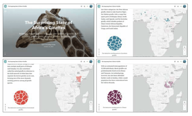
For instance, the StoryMap on giraffes (Chapter 5, page 112). Rather than simply mapping habitats. The narrative showed how small disruptions accumulate into lasting damage — something photographs alone couldn’t convey.
One of Carroll’s personal favorites is World’s Longest Mule Deer Migration (Chapter 2, Page 46), created by the University of Oregon Geography Department and the Wyoming Migration Initiative. It tracks “Deer 55” as she navigates a 150-mile journey across Wyoming’s fragmented landscapes. The story revealed how roads and fences have fragmented migration routes, cutting herds off from one another
“It combines tracking data, which I always find spellbinding,” Carroll notes, “with land use and land management data to show that, even in the nation’s least populous state, wildlife must navigate a series of subdivisions, fence lines, roads, and other hazards.” By focusing on a single animal, the story personalizes a broader environmental challenge — turning movement data into something compelling and urgent.
In another project, the Charles River Watershed Association mapped the Charles River (Chapter 8, Page 191) and the network of old dams affecting its flow. They layered in ambient audio — running water, birdsong — so that users could not only see the river’s past and present but hear it. The result isn’t flashy or technical. It’s immersive, a reminder that data grounded in sensory context becomes something felt as much as understood.
Carroll emphasizes that many of the best stories are built around people. One of the more memorable examples in the book follows a couple — Dorothy and Nathan (Chapter 7, Page 149) — who drive to the beach in an electric vehicle and try to find a place to charge. What sounds like a product demo becomes something closer to documentary: failed chargers, broken maps, delays. The reader sees a real-time gap between infrastructure and expectation.
This kind of storytelling makes policy feel lived-in. The map isn’t decoration. It’s the stage, the challenge, and the plot all in one.
What a Map Can Carry
The book quietly insists on cartographic responsibility. Carroll returns often to questions of representation: Who is included? Whose perspective does the map reflect? What choices shape what we see? He describes how Indigenous communities in the Amazon co-created StoryMaps that blended oral history with geography, drawing territorial lines shaped by memory, ecology, and cultural meaning rather than legal boundaries.
He doesn’t lecture on this. He illustrates it. And by doing so, the reader is drawn into those same questions — whether they are making a map or just reading one.
The Brains Behind the Maps
In one of the book’s most revealing chapters, Carroll explores the neuroscience behind storytelling (Chapter 3, page 51). He explains how place, memory, and emotion are physically linked in the brain — how grid cells and place cells activate when we remember where something happened. This connection helps explain why stories rooted in geography resonate so deeply.
This is where his argument takes shape: maps are not just explanatory tools. They are memory engines. They help us remember where stories took place, how we felt when we heard them, who they were about.
A Book Meant to Be Moved Through, Not Rushed
The pace of Telling Stories with Maps is unhurried. Carroll lays out examples the way a curator might lay out a gallery — step by step, layer by layer. There are sections where he outlines narrative structures or story types, but they don’t read like instruction manuals. They read like field notes from someone who’s been refining his approach for decades.
And just when the ideas begin to feel too theoretical, he brings in a new story: a visual rendering of Dante’s Inferno in 3D (Chapter 6, Page 140); a story on abandoned islands (Chapter 6, Page 129), or the story Justice Deferred, an account of the system of camps where thousands of Japanese Americans were confined during World War II (Chapter 6, Page 131).
You don’t need to be a cartographer or GIS expert to read this book. You just need to care about history, geography and how we explain the world. Journalists, educators, urban planners, conservationists, museum professionals — anyone trying to communicate with clarity — will find something useful here.
Carroll isn’t trying to dazzle. He is trying to equip. And he does it by showing what thoughtful storytelling can look like when it’s grounded in place.
“I’d love to think that the book might inspire GIS professionals to tell more stories about their work — the data they use, the insights they gain — to broad audiences,” he says in the interview. “I hope the book makes people appreciate the peculiar power of maps: how dense they are with information, how they provide an additional dimension to storytelling, how they add richness and context to narratives. And I hope they’ll use this potent mix of maps and multimedia to positive ends — to inform and inspire people about the interconnectedness of our planet, nature, and human culture.”
In the end, Telling Stories with Maps isn’t about promoting maps. It’s about telling stories with care — stories that embrace detail, hold complexity, and reveal the patterns that shape the way we live and understand place.
It’s a quiet book, full of carefully chosen examples and hard-won lessons. Like the best maps, it lingers, less for what it shows than for how it changes the way you see.
If you think maps are merely tools for directions or spatial data, Allen Carroll wants you to pause. He invites us to consider the map as something else altogether—narrator, interpreter, witness, advocate. What unfolds is more than a professional retrospective. It’s a generous offering from someone who has spent decades observing how storytelling evolves through technology, through visuals, and through the ways we make meaning from place.


Be the first to comment