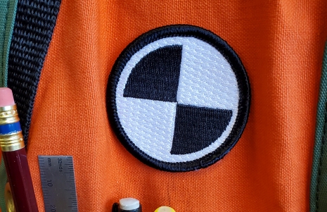
Would a universal symbol for surveying be practical and useful? Several candidate symbols may already exist.
We see symbols and logos every day, and some have become so ingrained in our minds that we can immediately and subconsciously recognize them. The roadside sign symbols for fuel lodging, camping, parking—those have become quite universal. A youngster zooming at great speed through the virtual world of a video game sees a red cross on a box and knows that is a med kit that can magically fix their virtual wounds. Copyright and trademark symbols, the five rings of the Olympics, the four rings of a car brand, engine check lights…. our world is full of such broadly recognized symbols.
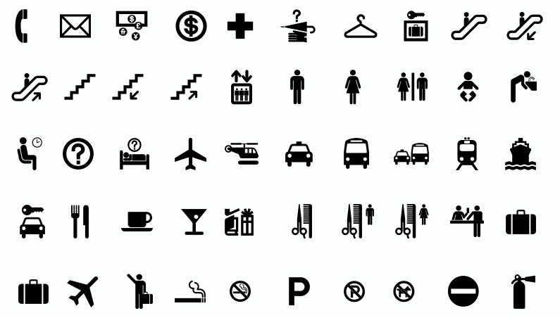
Discussions about designing a universal symbol for surveying have been going on for as long as I’ve been a surveyor, and I am sure for much longer than that. Every few years or so, there are various ad hoc groups formed to explore different aspects of the profession: succession planning, outreach, recruitment, standards, the future of the profession, etc. And often a topic in those groups is branding, which includes symbols and logos.
In 2000, Point of Beginning Magazine did a great piece to the subject, and solicited surveyors to submit their ideas for a symbol. And like these other initiatives, there were some thoughtful and appealing designs. But before something could be deemed suitable or practical as a universal symbol, a lot more thought, and specifications would need to be explored.
Could such a symbol work at both large and very small scales? Like a 16×16 icon, be recognizable as a 10pt. font symbol? As a cloth patch? In monochrome and color variations? Is the design too complex for these potential uses? And coupled with these considerations is the underlying question of what the symbol is intended to convey. Surveyors are great at juggling many skills, but is the field of branding symbology one of them?

Making Marks
Despite the depiction in books/films, like The DaVinci Code, of the fictional Dr. Robert Langdon, there is no such thing as a professor of Symbolology. That was a made-up discipline, but does have real-world connections in related studies of art, archaeology, marketing, etc. There is though an actual field called Semiotics, which involves the study of signs, but not necessarily as in signs-on-posts, etc. (though those contain elements of what the field more broadly considers signs). In Semiotics, a sign is defined as anything that communicates a meaning that is not the sign itself to the sign’s interpreter. That is pretty nebulous, and indeed the study of semiotics can encompass psychology, linguistics, anthropology, and sociology. But exploring the subject was quite helpful in understanding some fundamentals.
I’ve spent several years reading papers on branding, logos, symbols, semiotics, and more, but have not found anything to provide pat answers to the questions surrounding a potential symbol for surveying. But there are some common threads of consideration:
- Groups targeted for ready recognition of the symbol
- The ontology (interconnection) of the various mediums for depiction
- Practicability for intended mediums
In exploring the reference materials on the subject, I noticed that having a direct connection to any physical aspects of the subject was not necessarily a high priority. It can help, but aspects of the design might not be readily recognized outside of the those with specific knowledge. For instance, you see the three diamonds in a Mitsubishi logo. The name literally translates from Japanese as “three diamonds”, but to most folks around the world it just represents a Mitsubishi logo.
Who Needs to Recognize the Symbol?
Primarily, and initially, that would be surveyors, from the professional to the non-professional. Consideration could also be taken to address the much talked about goal of broadening the perception of the profession to highlight the growing range of things that surveyors do. Many people will see someone standing behind a tripod and recognize that as a surveyor, but what of the drone, hydrology, or mobile mapping operator? Anyone can operate a drone, but don’t we want to emphasize that when surveyors operate them and apply their skills and professional judgement, that drone means serious business?
What if, on any jobsite, you could immediately recognize who the surveyors are by the symbol on their hardhat, vest, back of vest, instruments, instrument cases, and vehicles? This has very practical applications, but could also serve to distinguish the profession, and foster a bit of “badge-of-honor” status. I’m sure that some reading this will immediately think “we should have a different symbol for licensed surveyor”. Fine, add a different color or extra line around it, but keep the basic elements.
If widespread enough, it could become a symbol recognized by a substantial segment of general population. At some point in their lives, nearly everyone has encounters with surveyors, certainly in all related client industries like AEC (architecture, engineering, construction), landowners, and business owners. They’ll get to know the symbol.
Part of the appeal for some considering entering various professions and career paths is the sense of being part of “something”, and a universal symbol can foster broad recognition of a “something”. And being a relatively small but highly specifically skilled and respected profession and field like surveying, certainly can be an appealing “something” to belong to.
Ubiquity
The ontology: how the many ways such a symbol could appear, for various purposes, interconnect. It is conceivable, that if a symbol was simply enough, it could work in any size/medium. And if not orientation dependent, it could appear in any or all physical elements of surveying. On PPE (as mentioned), documents, as a companion to other symbols and logos, as a font symbol, icon, on monuments—the possibilities are endless. The criteria for physical representation of the symbols, and key design criteria would need to be deeply explored first.
No one is suggesting replacing existing logos for firms, organizations, institutions, etc; those convey messaging and branding specific to those entities. A red cross outside a hospitals does not replace any of the identifying symbology for the hospital; it simply quickly identifies it as a facility with medical services. A universal symbol for surveying could be adjunct to other symbology.
Adoption
The surveying profession spans the globe, covers a wide range of services, and is not governed or guided by any single entity.There are bodies in different countries and states for standards, practices, licensing, and examination, etc. None would have the authority to mandate the use of a symbol, except within their own respective purveyance.
Perhaps a top-down authoritative style push for adoption would not be the most effective or practical approach and could even backfire. A better route could be to foster adoption, through several early adopters, and then hope it grows organically.
I hate to say this, but if there is any serious effort to foster adoption of a universal symbol for surveying, then trying to seek consensus among many institutions might mire the process in bureaucratic indecision for years (or decades). As the joke goes: “Thou shalt not committee” …
There are bodies like the International Federation of Surveyors (FIG) though, that could be and excellent mechanism for fostering adoption internationally. And at the national level, professional organization like the National Society of Professional Surveyors (U.S) could as well.
But let’s look outside the traditional paths a bit. There is an old saying that “a standard is a product that sells a million copies”. If surveying instrument manufacturers were encouraged to put the symbol on every instrument or component that they target for surveying customers, that would be a great start. I’d talked to some manufacturers, and they seem quite interested in the idea as it would further establish their own branding and identity in serving the surveying profession and client industries.
Schools could make it a convention to hand a graduating surveying student their survey symbol patch. Private firms could add the sticker to their vehicles, just like those oval country abbreviation stickers. One could go down a rabbit hole of potential ways to foster adoption of such a symbol. But it might be easier than we might imagine, especially if such symbols already exist.
Tripods
Seeing someone standing behind a tripod and for many people, already hints that they might be a surveyor. If you ask surveyors to design a symbol, the majority of responses will have an instrument on a tripod. You will also see this symbolism in civil engineering as well. Related industry vendors have capitalized on this, for instance a retro logo for Autodesk evokes both tripods, and calipers.

Arguably, the tripod is the default symbol for surveying, and has been for as long as surveyors have been putting instruments on tripods. It is often pointed out that surveyors are not just expert measurers, but primarily engaged in making professional judgements about land records. But is there any practical way to make a symbol that emphasizes the professional aspects of the profession? And on the other hand, expert evaluation of land records is to make professional judgements about land, which is spatial in nature, and measurement is an essential element. So why not feature the most recognizable existing “symbol” of surveying measurement?
Some of the drawbacks of an instrument on a tripod is the complexity and orientation limitations. Plus, how generic can the instrument on the top be? Or if an abstraction is acceptable, how can the instrument be represented that still conveys that is a surveying instrument? Can such complexity work in very small formats like an icon or font symbol?
A tripod symbol provides a connection to the rich history of surveying, desirable for many reasons. But when it comes to perhaps dovetailing with initiatives to speak to the future of surveying, how the profession has evolved, the many services and areas of expertise that surveyors have grown; is the tripod the best symbol? There was an imitative several years ago to help promote the profession as a desirable career. A beautiful logo was developed, with stunning artistic framing. and presumably to present the modernized profession, a silhouette of a scanner on the tripod. Whether the choice of a scanner for the instrument was the best choice or not would be one matter, but the overall complexity was more of a challenge. And one hazard one putting a particular technology in a logo is that it will forever date the logo.
On Target
There is another symbol, that appears throughout surveying, all over the world, and has been adapted into logos and graphics for firms and institutions: the ubiquitous check-target. In addition to adaptation for branding, you see the physical targets with check patterns all over the world. I remember walking through the tunnel of the Large Hadron Collider at CERN and immediately recognizing check targets set all over the structures. Why not design a simple symbol that incorporates a check target pattern?
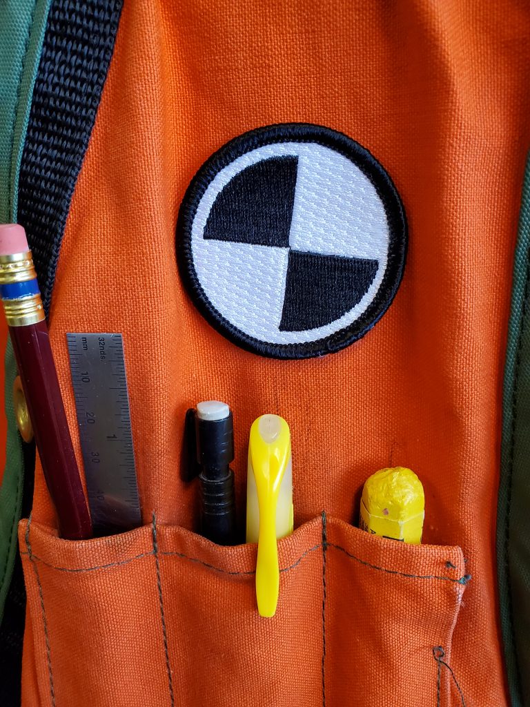
I did a lot of research into this and have not found that a symbol comprised of a circle around a quad check pattern was being used by any entity, public or private, and did not symbolize anything else. The simplicity means it can work at any scale and color/tone. I did some tests, made up some patches for vests, strikers for hard hats, instruments, and cases, and waited for reactions. Surveyors got it immediately.
Surveying undoubtedly has evolved, as it always has. And what has this new century heralded? We are currently in the beginnings of a massive expansion/upgrade of the world’s infrastructure, unprecedented in history, and surveyors will have an expanded role in this.
While the 20th Century saw a tremendous amount of surveying work related to housing and development (e.g. the related boundary work), this century is seeing a growth in roles for surveyors related more closely with the digitalization of infrastructure development; working in 3D. scanning, drones, reality capture, and more. Not replacing the existing surveying services, simply expanding.
These expanded roles are surveyors for the taking, but only if we are proactive. What better way to help stake out (no pun intended) these expanding roles for the surveying profession than to put our “brand” on it, with a sleek, simple, and functionally relevant symbol. With these considerations in mind, My nod goes to the target symbol.
And once others see such a symbol on a jobsite, they might wonder, “what is that badge?”. That’s a surveyor… a bit of an exclusive club of some of the toughest and most highly skilled folks in the field…




Be the first to comment