Heat waves are seemingly becoming more intense and more dangerous for vulnerable populations. GIS has helped to pinpoint the hottest neighbourhoods of the largest cities throughout Canada and illustrate which regions are most at risk when experiencing extreme heat events.
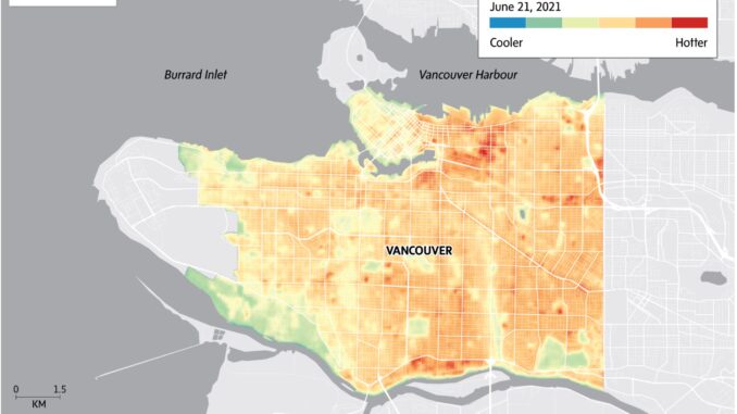
Statistical analysis by the B.C. Centre for Disease Control showed that the heat wave British Columbia experienced in June 2021 was Canada’s deadliest weather event in history. While the heat impacted the entire city of Vancouver, the intensity of the heat experienced differed depending on the neighbourhood. Many factors contributed to this notable difference in temperature, namely, distance away from water, amount of green space and income levels. Income plays a significant role in vulnerability to heat-related illness during a heatwave as the lower-income neighbourhoods tend to be hotter, and residents are less likely to have air conditioning.
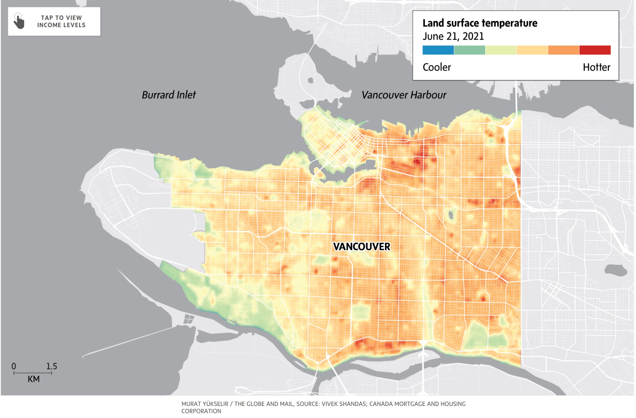
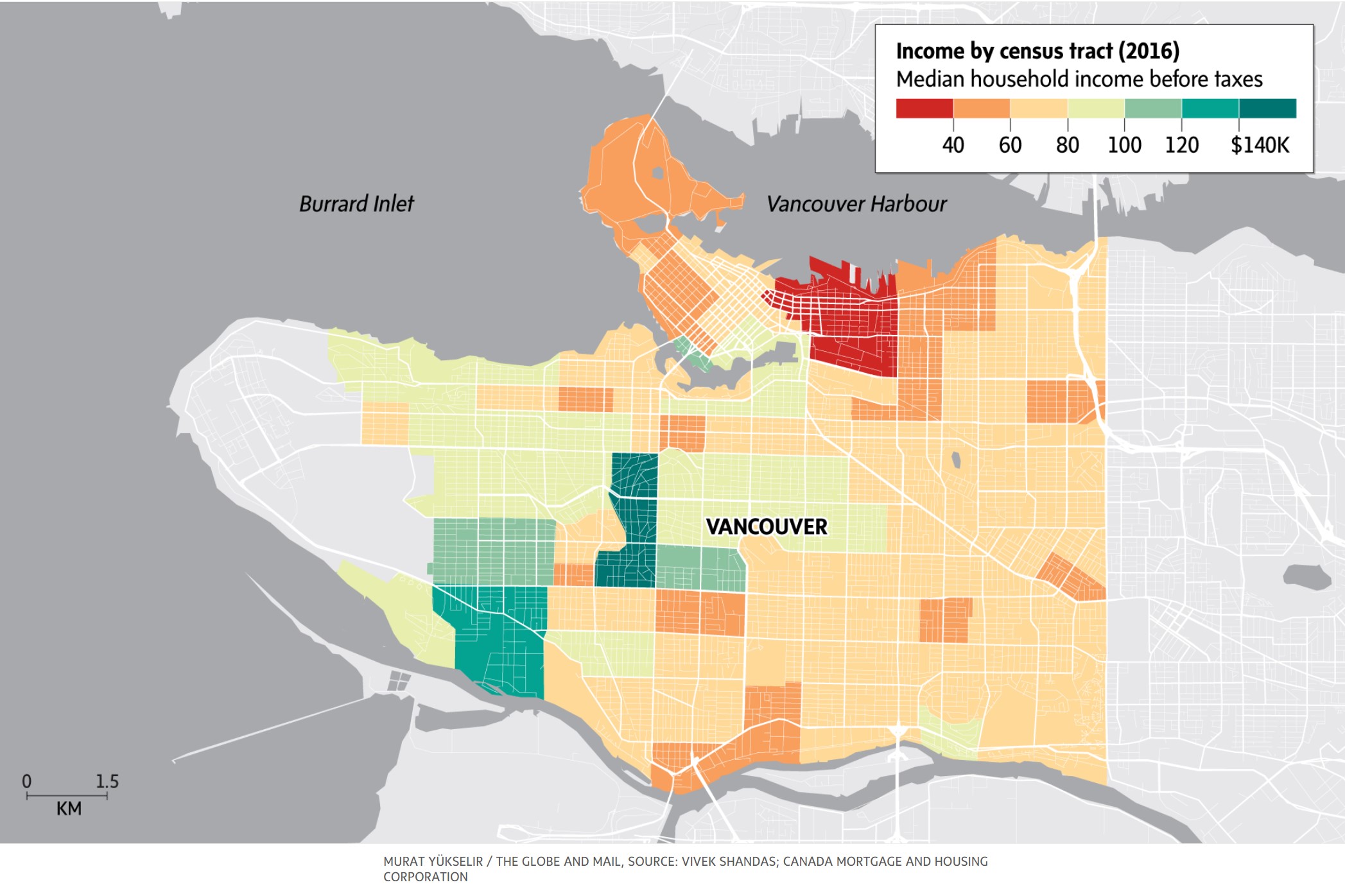
Map from a Globe and Mail article comparing land surface temperature and median household income in Vancouver. Source: Vivek Shandas; Canada Mortgage and Housing Corporation

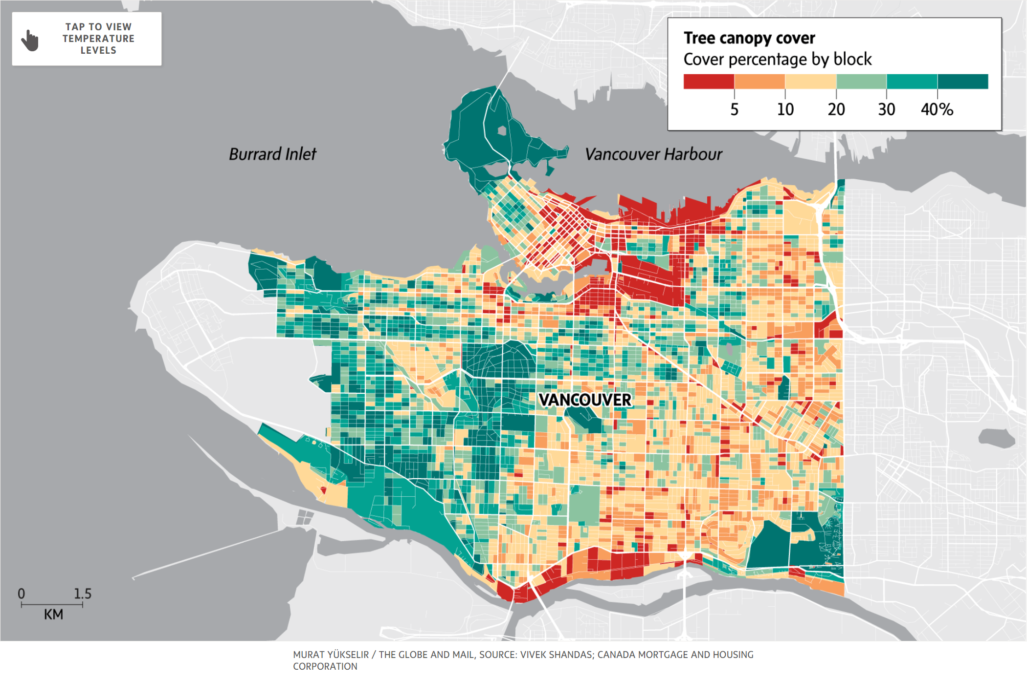
Map from a Globe and Mail article comparing land surface temperature and tree canopy cover in Vancouver. Source: Vivek Shandas; Canada Mortgage and Housing Corporation
An interactive map by HealthyDesign.City was created using satellite and census data. This map shows tree canopy cover and heat islands and compares this with vulnerable populations for many cities across the country.
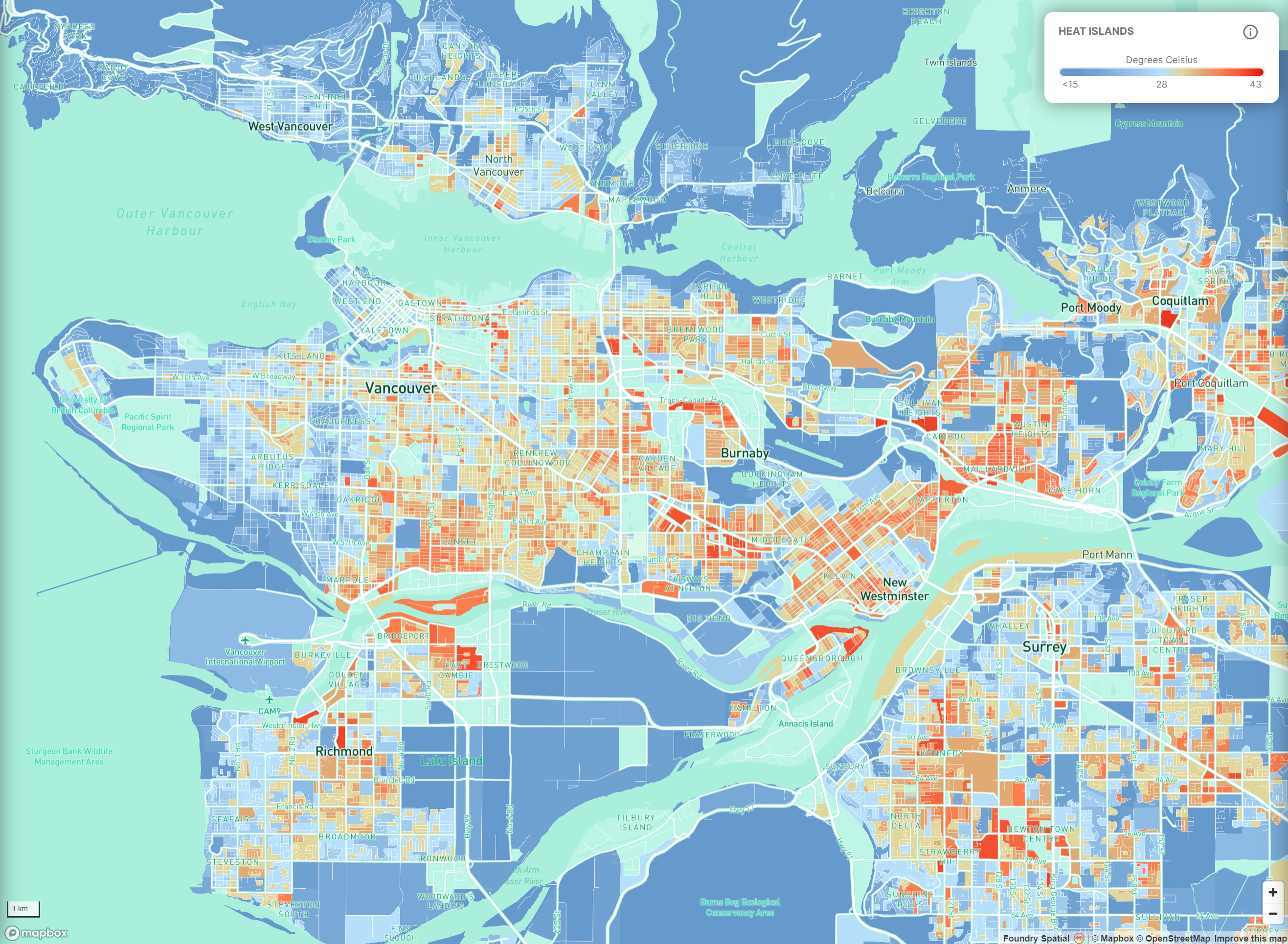
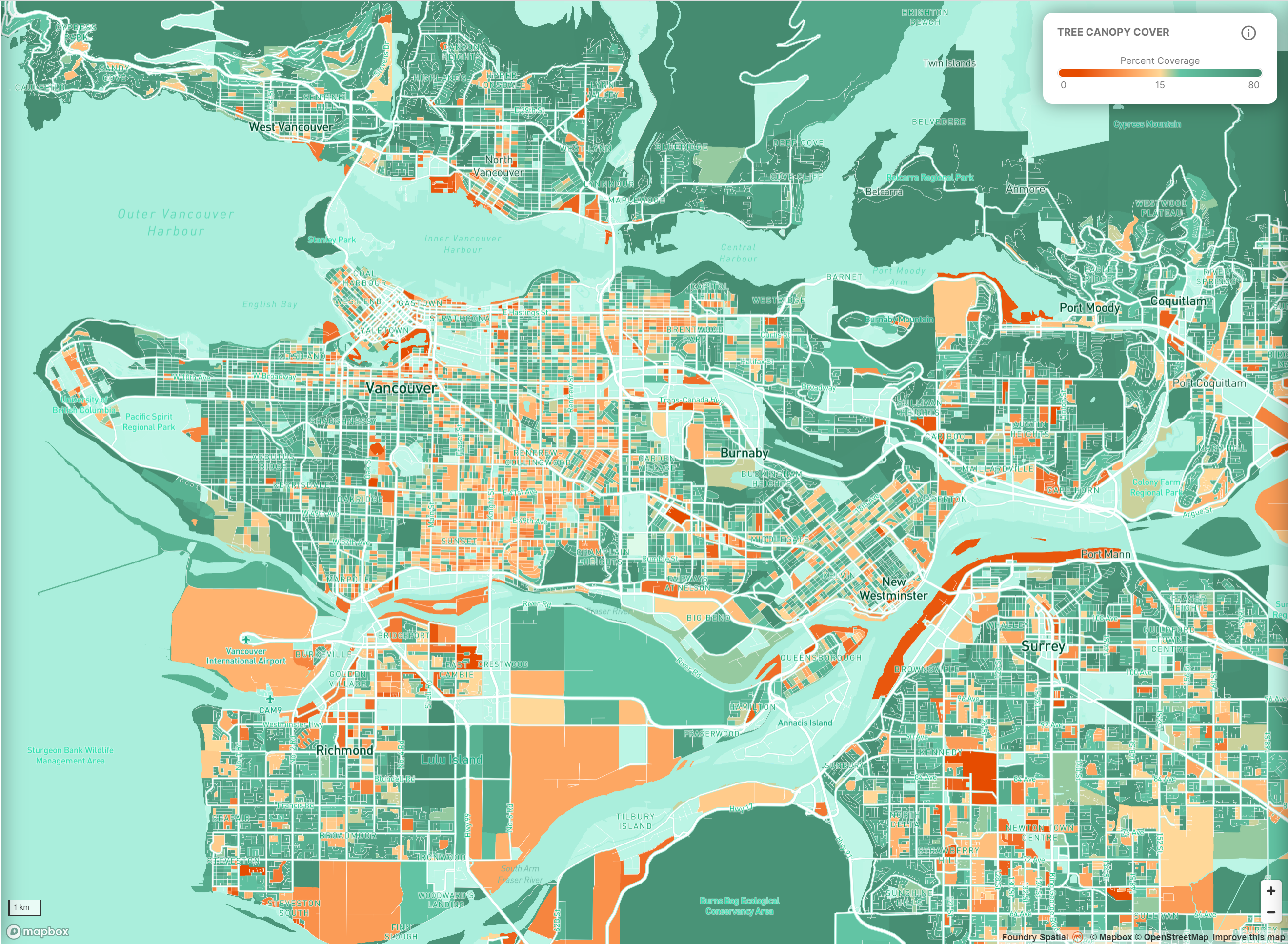
An interactive map comparing the heat islands and tree canopy cover in Vancouver. Source: HealthyDesign.City
Maps such as those above show the link between land surface temperature and income. Neighbourhoods with lower incomes are generally further away from water and have fewer green spaces. This is known as the urban heat island effect, where urban areas are more likely to experience higher land surface temperatures. Contributing factors are buildings being closer together, lack of vegetation not offering shade, urban areas producing heat islands, and concrete absorbing the sun’s energy and releasing that energy at a slower rate. With nearly 75% of Canadians living in urban centres, the urban heat island effect is a phenomenon most of us know too well.
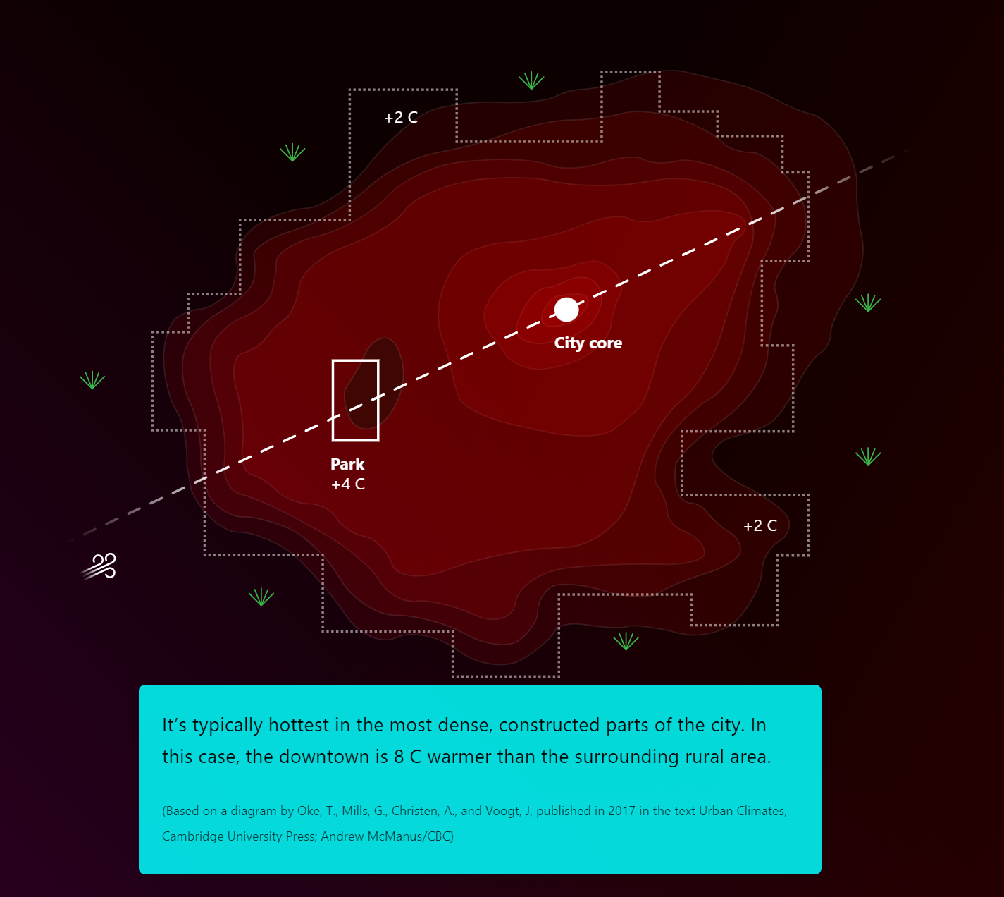
Illustration showing how the urban heat island effect can impact city centres. Source: Andrew McManus/CBC
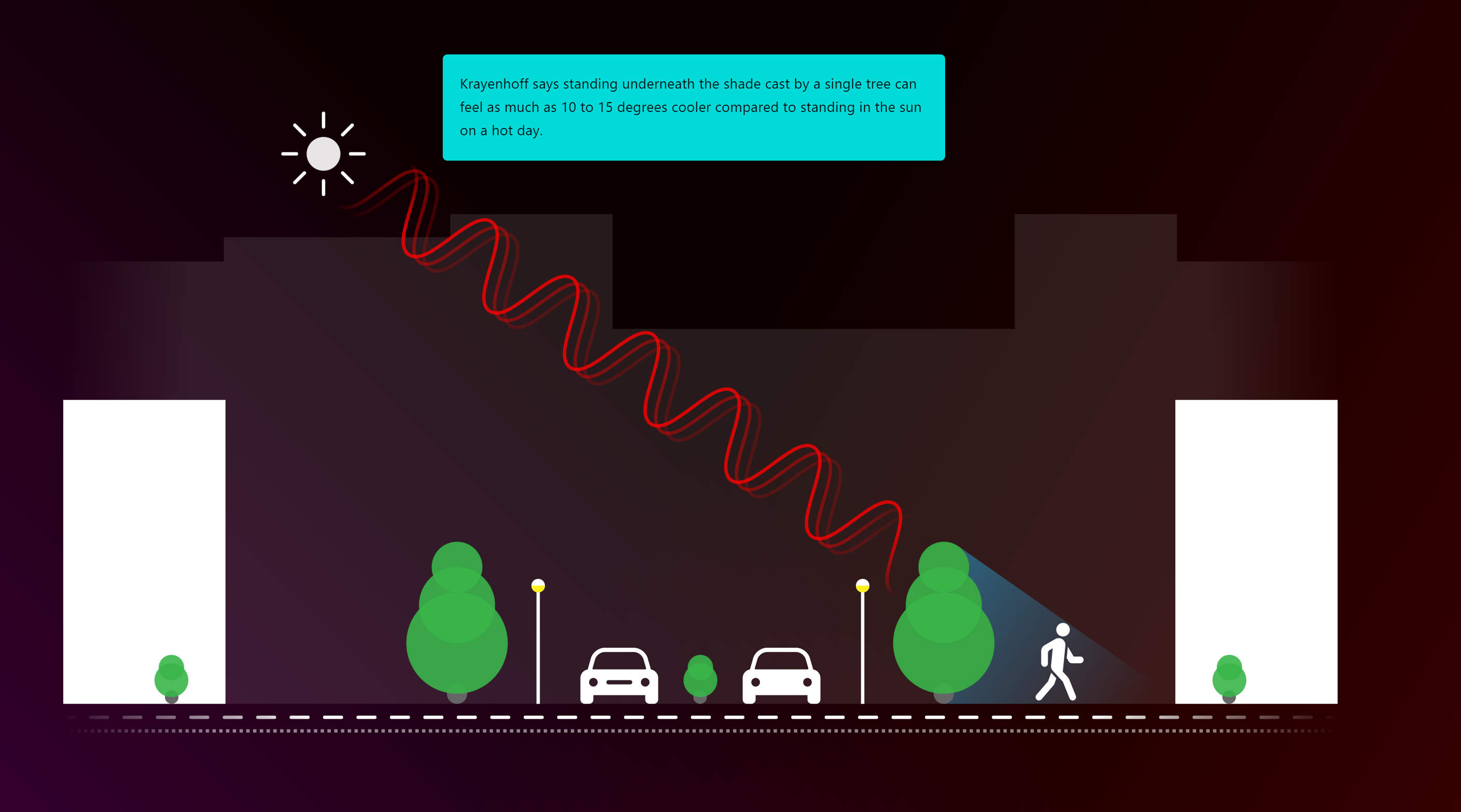
Illustration showing how shade can make a difference. Source: Andrew McManus/CBC
In London Ontario, researchers from Western University are using air temperature, satellite images and thermal imagining cameras to measure the heat island effect to see which neighbourhoods are impacted the most during extreme heat. With this research, they hope to assist urban planners with designs that can help cool down certain neighbourhoods.
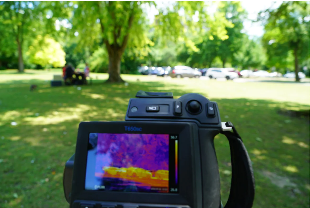
Thermal imaging camera showing surface temperatures. Source: Colin Butler/CBC News
Carina Luo, a geospatial data analyst at the University of Windsor, has created a new app showing the heat hazard of the Windsor-Essex area. Lou measured land surface temperature using USGS Landsat 8 images and measured social vulnerability to determine the heat hazard in the region.
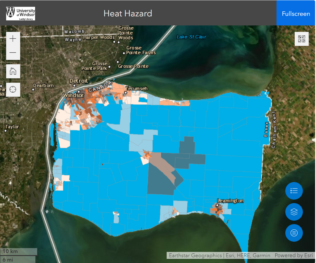
Heat Hazard map highlighting the areas in Windsor-Essex that are most vulnerable to extreme heat. Source: CBC News
In British Columbia, Interior Health, Vancouver Coastal Health, Fraser Health, and the University of British Columbia (UBC) have created story maps that show high/low temperatures, wildfire smoke vulnerability, and flooding for many areas in the lower mainland and British Columbia’s interior. These story maps display the vulnerability to heat and are analyzed by considering exposure, sensitivity and adaptive capacity to higher temperatures.
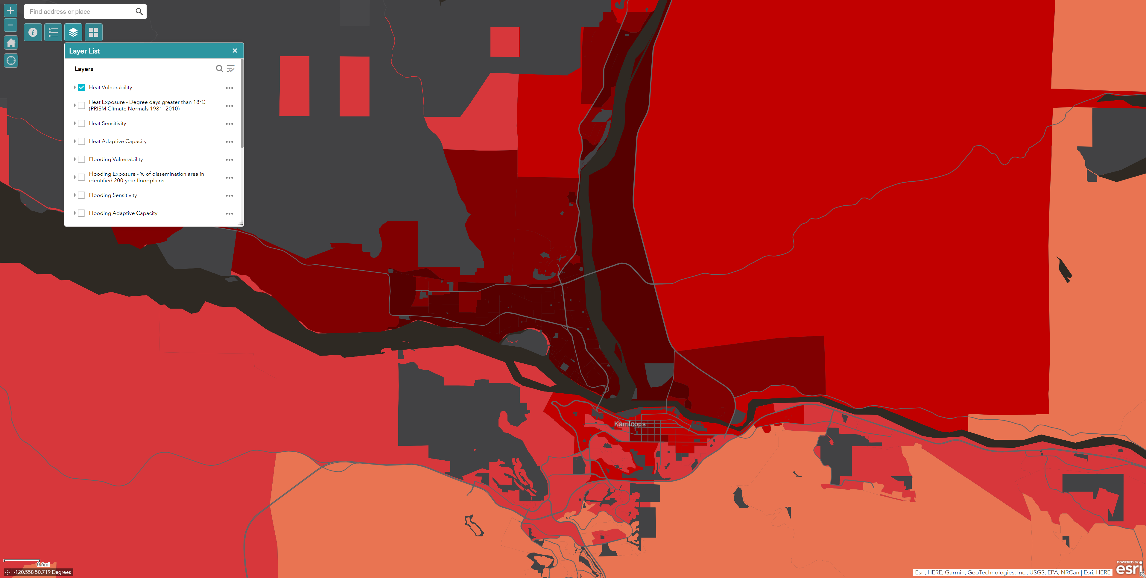
The heat vulnerability of the city of Kamloops, B.C. Source: Interior Health
The City of Ottawa has created a heat map using satellite imagery from a heat wave that occurred in 2019. Through the creation of this map, they were able to see that the surface temperature varied vastly, with a reading of 15 °C in some areas and 38 °C in other areas.
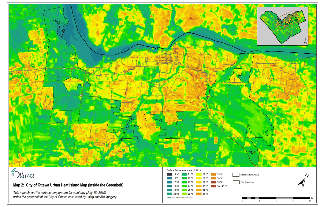
Heat map created by the City of Ottawa. Source: CBC News
Using satellite imagery, data analysis done by CBC News looked at the most populated cities in Canada and found that those areas of the city with lower incomes and a larger immigrant population were located in the hottest part of the city. The CBC interactive tool allows you to look up your postal code to compare your neighbourhood with other neighbourhoods in the metropolitan area you live in. You can also look at each city in more detail to see the relationship between land surface temperature and variables such as income, immigrant population and vegetation.
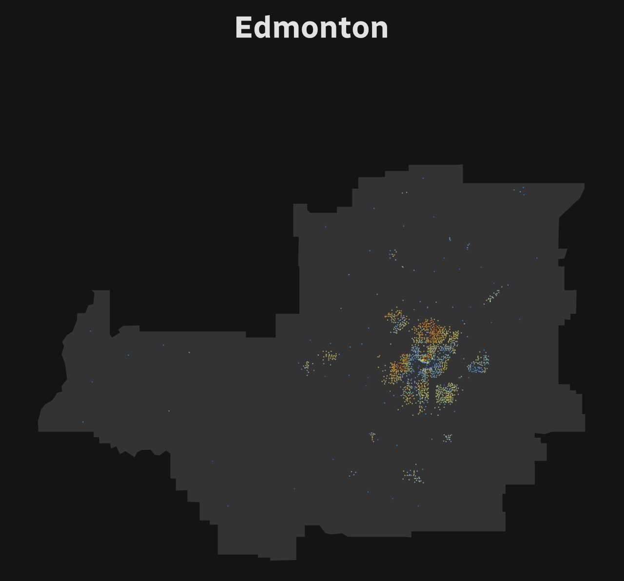
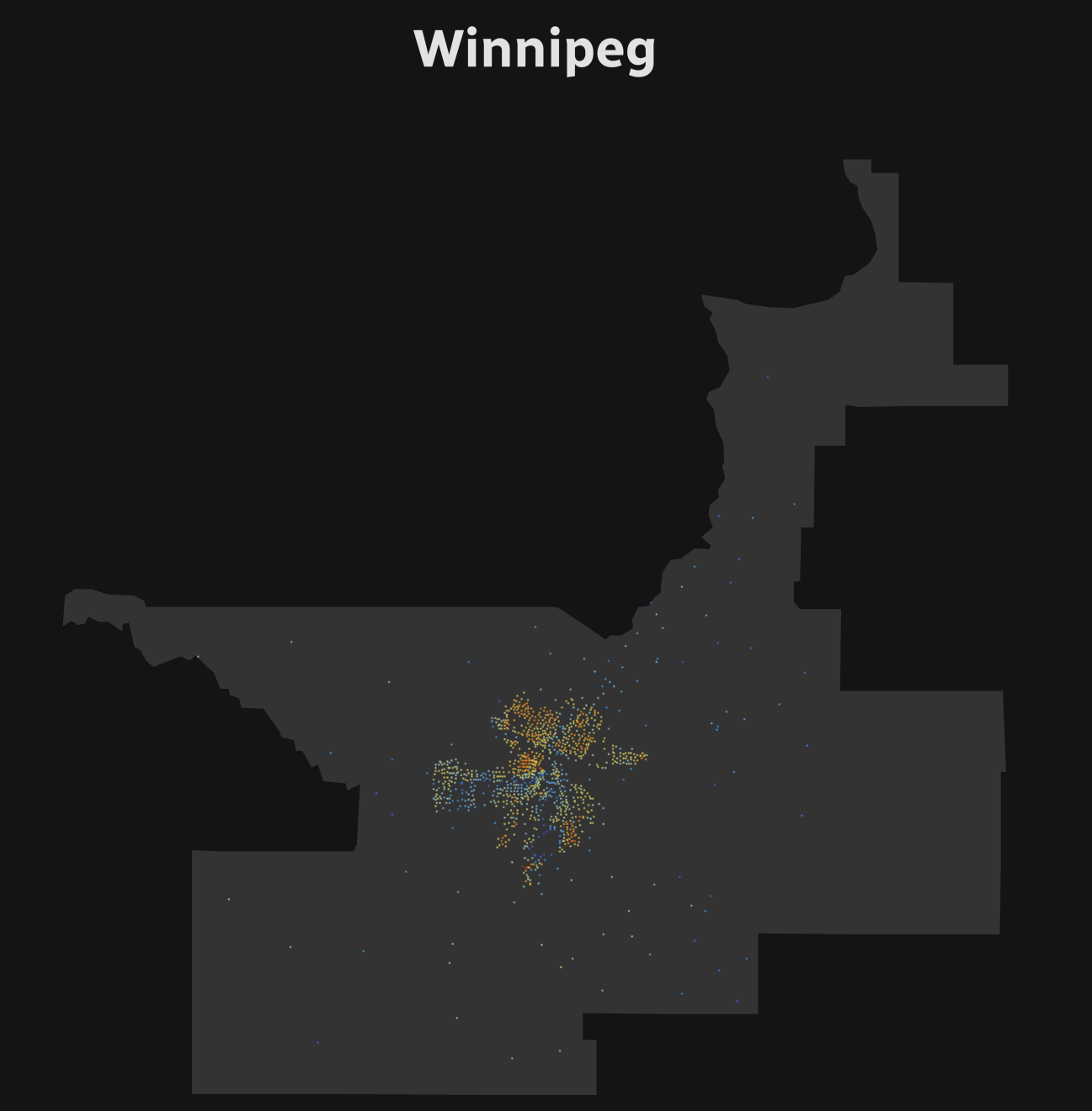
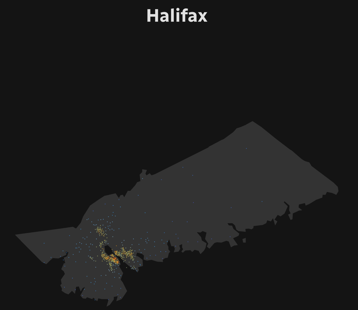
Areas with the hottest and coolest land surface temperatures in Edmonton, Winnipeg, and Halifax. Source: CBC News
Maps can be such a powerful tool to indicate where heat vulnerability is occurring within a city. This information can then go on to assist urban planners in decision-making, including, where to add more green spaces, where to open more cooling centres or where cooling centres and pools should be open late. The use of GIS can show where changes need to occur to significantly reduce how those most vulnerable experience heat.
Resources:
https://climateatlas.ca/urban-heat-island-effect
https://www.cbc.ca/news/canada/london/urban-heat-island-london-ontario-1.6529392
https://www.cbc.ca/news/canada/windsor/windsor-essex-heat-exposure-social-vulnerable-1.6496894
https://www.cbc.ca/news/canada/ottawa/how-hot-is-your-hood-new-map-ottawa-1.6192110
https://newsinteractives.cbc.ca/features/2022/heat-islands/
https://storymaps.arcgis.com/stories/7bf7141bb6fd41fb9b61a02cfbc61ecd
https://storymaps.arcgis.com/stories/19911ac6afeb4ad0b2f3bce166829337
https://newsinteractives.cbc.ca/features/2022/heat-island-solutions/


Be the first to comment