We typically think of a GIS as features on a map with a maximum of three dimensions:
- Longitude
- Latitude
- Height
However, there is another dimension that we can add to features, and that is time. Adding the dimension of time to a feature lets us look at the feature as it exists in different intervals, for example, days, weeks, months, or years. For example, how does the temperature of selected cities in British Columbia change over the course of a year? This might help you to determine where to spend your next summer or winter vacation.
Time as a 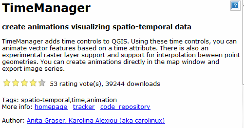 dimension of a feature is implemented in QGIS through the splendid TimeManager plugin. As with all QGIS plugins, this plugin installs directly in the QGIS Plugin Manager window. You don’t have to download and configure.
The TimeManger plugins shows the heights which Open Source software at its best can attain. When the great developers of the world take ownership of a particular Open Source project, their collective power can match and surpass any product that proprietary software can offer.
TimeManager displays time on features through the use of a slider. The user drags the slider to visualize the features at a given date and time. There is also an animation component and the user can set the interval from microseconds to years.
![]()
![]()
Analyzing the effects of time on features is a relatively new area of study, if only because the software the data have not been available. Fortunately, just as the software has now been created, the data have now also arrived.
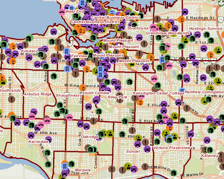
One such area is in the area of crime. As one example, the Vancouver Police Department (VPD) has just published the GeoDash website which displays locations of various crimes on a map.
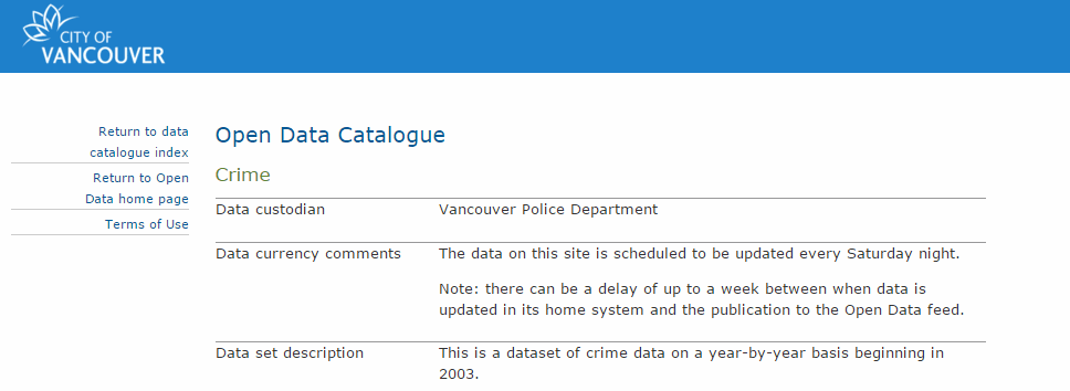
In conjunction with GeoDash, the City of Vancouver’s Open Data site now offers the same data as GeoDash as downloadable data in formats of SHP, JSON, CSV, and XLS. Although Open Data has offered the last two formats for several years, it now includes coordinates in these files so that the user can put the crimes on the map themselves.
The availability of both high quality Open Source software and crime data means that analysis of crime is no longer limited by the resources of the VPD, created by expensive proprietary GIS software. Other users with GIS knowledge can create analysis of crime from these data and make it known for the public good.
For example, if you are considering buying property in a given neighbourhood, wouldn’t you like to know how many crimes have been committed in this area and what types of crimes they are? There is already one savvy real estate agent in Vancouver who offers a custom solution for crime analysis based on the Vancouver Open Data crime data. More custom solutions seem likely to follow.
The GeoDash site currently offers crime data at the granularity of only year and month. This is attributable to the VPD’s concern about releasing “too much” data to the public. However, since the VPD data has both date and time as attributes to crimes, it is hoped that eventually both GeoDash and Open Data will provide these more granular attributes.
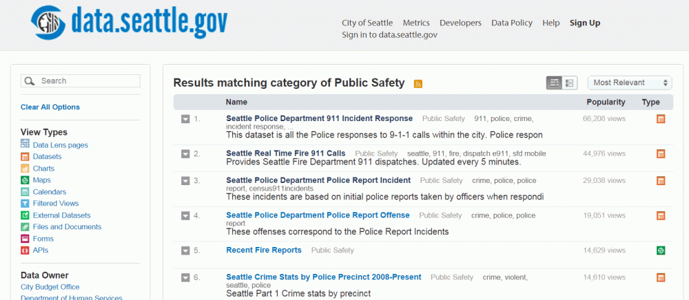
In the meantime, Vancouver’s neighbour to the south, Seattle, has a well-developed Open Data site with a Public Safety section. This section has incidents of both police and fire calls, sliced and diced by various views. The incidents have both date and time attributes.
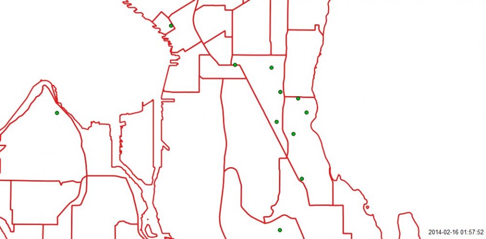 Using QGIS and TimeManager, we can filter the results from the last complete year, 2014, to display only crimes of burglary and make a video to display these crimes in intervals of three days from January 1, 2014 thru December 31, 2014.
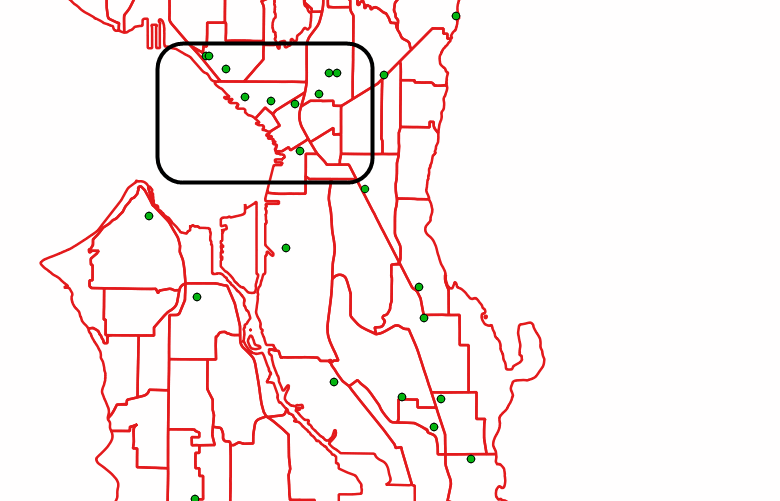 The video gives an overall view of burglaries over the course of the year. We can note patterns; for example, a certain neighbourhood seems to get a lot of crimes all within the same three day interval. What causes this pattern? Here we would have to dig deeper into the data. The video has helped us to know where to look further.
The Geographic Information Systems certificate program at Langara College Continuing Studies harnesses both Open Source software and Open Data to provide new opportunities to analyze the world around us. What products will flow out of this fortuitous confluence of software and data? No one really knows. Only time will tell.

Be the first to comment