There has never been a time in the history of GIS when so much free, high quality data has been available. As an example, the WorldClim site (http://www.worldclim.org/) offers temperature raster data, on a global scale, at resolutions as high as 30 arc seconds (roughly 600m x 900m pixels at the 49th parallel).
The raster datasets cover minimum temperature, maximum temperature, average temperature, precipitation, and bioclimatic variables. This last dataset includes nineteen derived variables such as mean temperature of wettest quarter and precipitation of wettest and driest month.
The Worldclim website has very brief explanations of how to import its data into various analysis software. This article expands on that by showing a methodology for working with WorldClim’s temperature data using QGIS, our favourite free, Open Source GIS software.
Our first step is to go to the web site http://www.worldclim.org/tiles.php and select zone 01.

A group of links now appears.

We select the Mean Temperature link, which allows us to download the zip file for zone 01.
We repeat the process for zones 02, 03, 11, 12, 13, and 14. Now we have all of the Mean Temperature Data for Canada plus most of the United States.
Unzipping the tiles allows us to observe the files in their folders. Each folder has 12 TIF images, corresponding to the mean temperature data for the months January through December, that is months 1-12.

The page (http://www.worldclim.org/formats1) provides details on how the data are organized. For example, we are informed that temperatures in the data set are stored to the nearest tenth of a degree, but in integer format through the use of a simple mathematical formula of degree Centigrade x 10. Thus, a temperature of 12.3 degrees C is stored as the integer 123.
Although it is not explicitly stated on the website, we know that highest and lowest temperatures ever recorded on earth are around 58 C and -88 C respectively, we can infer that this allows the repository to represent its temperature data using the short int data type (16 bit signed integers) instead of as floating point numbers which usually require at least 32 bits of storage per number.
Once we have our data, we create a new QGIS project and load the raster data for July (the file tmean7_01). Using the QGIS Identify tool on one of the raster’s pixels gives us the value.

Does this mean that the temperature in Alaska was 123 Celsius? No, as we explained above, that temperature is actually 12.3. For our purposes we can leave the temperature as 123.
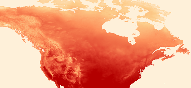
Next, we put all of the July data for the remaining 6 zones covering Canada on the map, that is tmean7_02, … 03, … 11, 1… 2, … 13, and … 14. Using the raster merge feature of QGIS we turn them into one large raster. When we theme the raster by an orange to red colour ramp, what do we see?

It looks like it is very hot in North America in July!
The cells in the grid produce a finely detailed continuous pattern, but we can understand the picture more clearly by aggregating the data. This is where zonal statistics comes in.
In this example we use the Statistics Canada Dissemination Areas, but it could be any group of polygons that traverse Canada, for example, Postal Code boundaries. We can use the Zonal Statistics tool to get aggregate temperature data for each dissemination area.
We add the dissemination areas to the map and invoke the Zonal Statistics tool. We started this exercise discussing the mean temperatures, but why not aggregate the other data while we are at it?

When the process completes we have new fields in our Dissemination Table, prefixed by ZS_.

Next, we add a layer for BC cities and zoom to the Kelowna area. Using the Identify tool, we get the aggregated values for the dissemination areas around Kelowna. One dissemination area’s mean temperature for July is calculated as 19.7.

To verify this temperature let’s go to the Wikipedia site and scroll to the Climate data section. The mean temperature for Kelowna in July is 19.5, which is pretty close to the temperature that our software has calculated.

We can scroll out and observe that the general pattern of the dissemination matches what is generally known about the Province’s weather, that the southern central part of the Province gets the most heat in the summer.

So, what can we do with this analysis? The scientists who developed these datasets intend it for research purposes in such areas as climate change and bio-diversity studies. However, when GIS gets in the hands of the common man, there is no limit to the possible uses of this technology and the datasets that are so freely available.
For example, if I had a layer of Provincial campsite polygons, I might use zonal statistics to aggregate the raster cells not by dissemination areas, but by campgrounds. Having the aggregate mean, min, and max temperatures for Provincial campsites throughout the summer would certainly help campers to make informed choices about where to stay.


Be the first to comment